All work

One token source for Apple and Material, in light and dark

Designing a mobile design system where one token source drives Apple and Material components, in light and dark mode, from Figma to SwiftUI, Compose, Flutter and CSS.

Client
Luna DS
Role
Lead Designer
Read
3 min
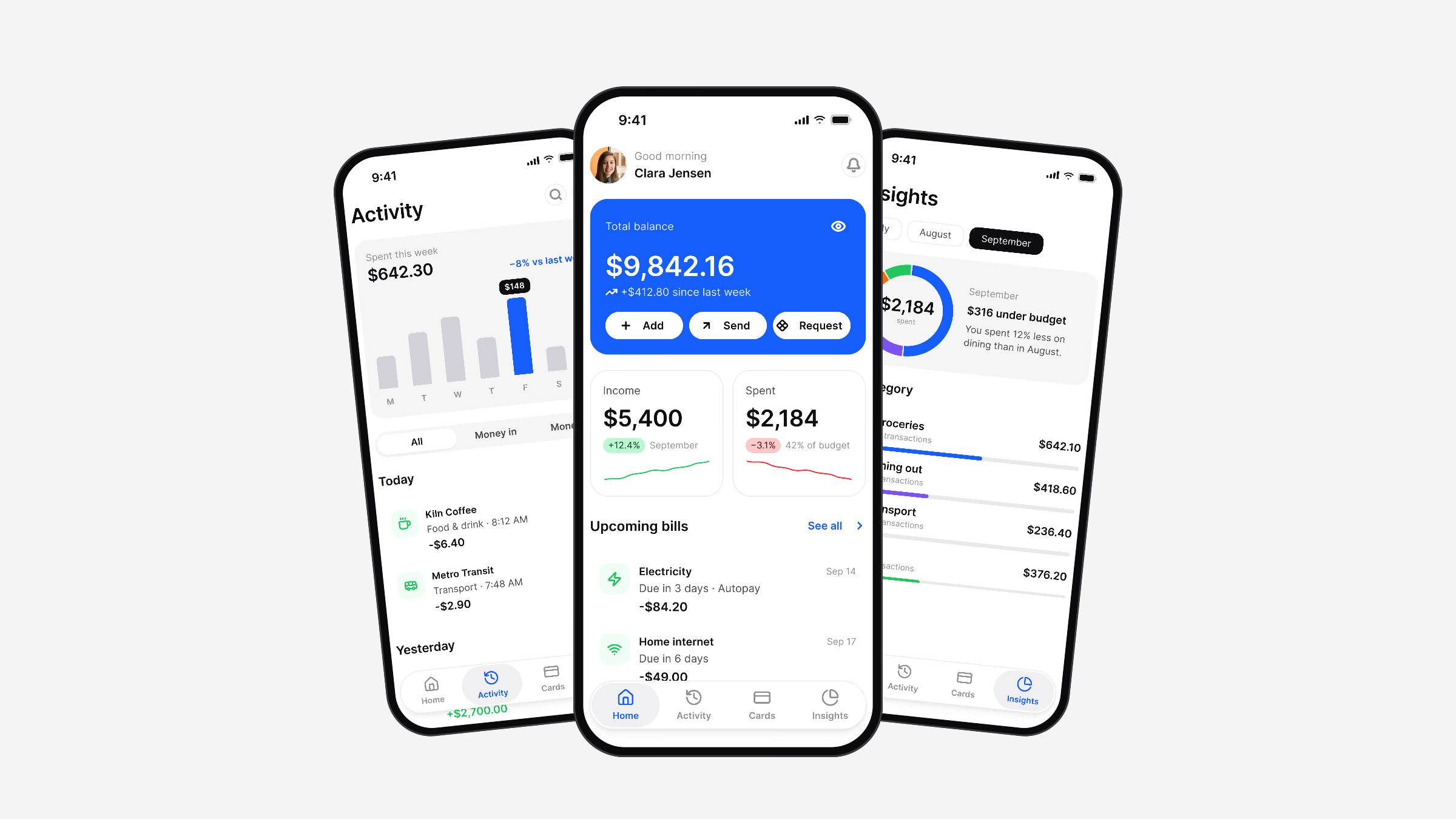
Three Luna Finance screens: activity, home and insights
556
Variables in six collections
79
Components, every state on a token
88
App screens in light and dark
0
Dark variants to maintain

The short version

Context
Mobile teams ship the same product twice: once in Apple’s language and once in Google’s, and usually twice more for light and dark. Kits that look complete on day one fall apart on the first rebrand, because colors, radii and type sizes are typed by hand into hundreds of layers.
Problem
Every hand-drawn copy is a place where the next change can be missed, and the code never quite matches what was drawn.
What I did
Luna is a Figma design system for iOS and Android apps, built so that one token source drives Apple and Material components in light and dark mode, with outputs for SwiftUI, Jetpack Compose, Flutter and CSS.
Impact
I designed it end to end, from the color ramps to the components, the native patterns and complete application screens.

Principles

Components point to semantic roles such as brand/base or text/strong-950, never to a value. The role points to a foundation, and the chain runs one way only.

Light and Dark are two modes of one collection, so no component has a dark variant. Platforms differ in numbers, not intent: a Platform collection carries the 44 or 48 point touch targets and bar heights, so one component obeys both.
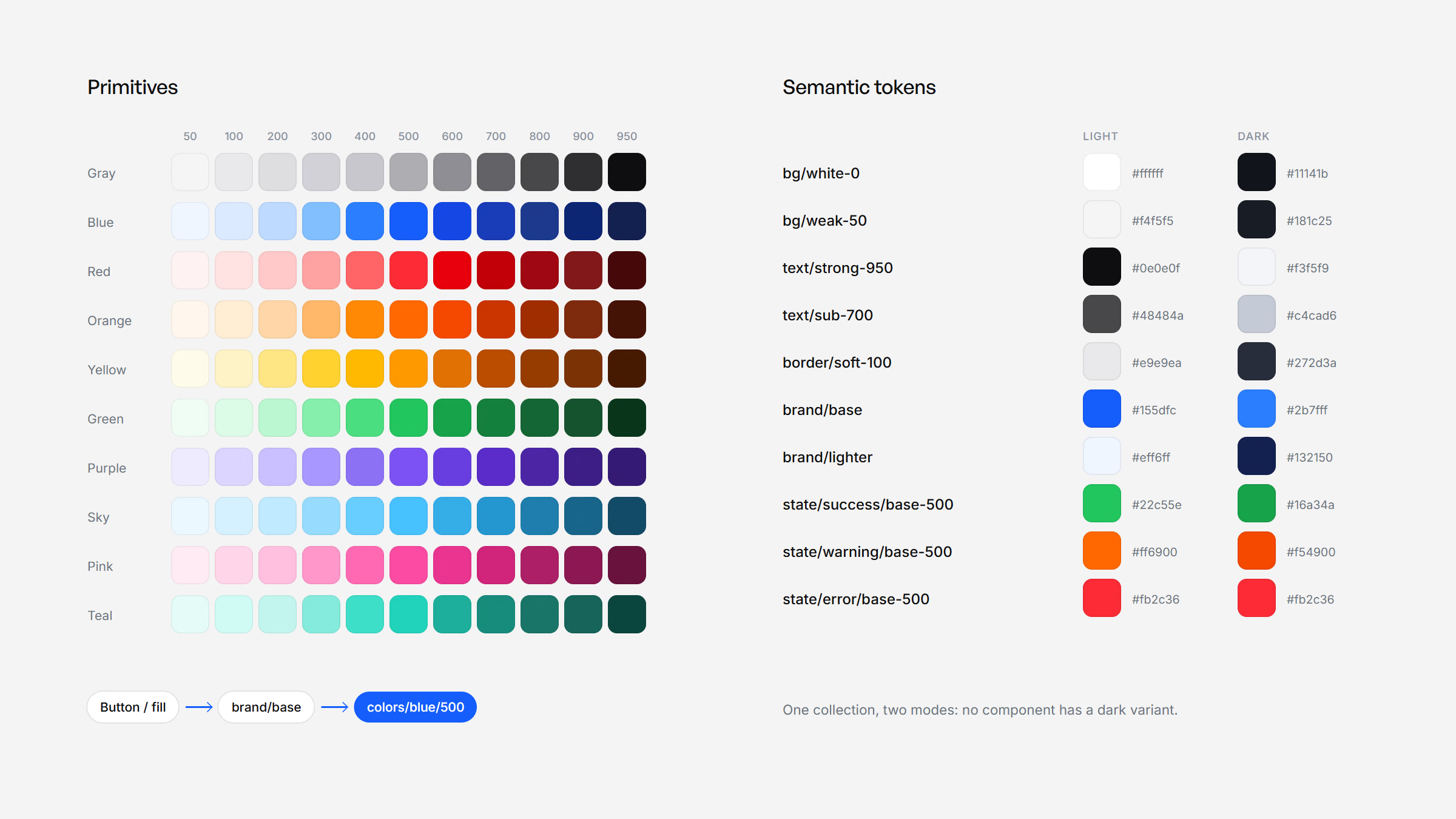
Ten primitive colour ramps and semantic tokens with their Light and Dark values, and the chain from a component to a primitive
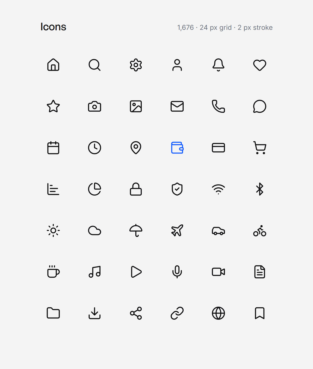
A selection of Luna icons on a 24 px grid with a 2 px stroke
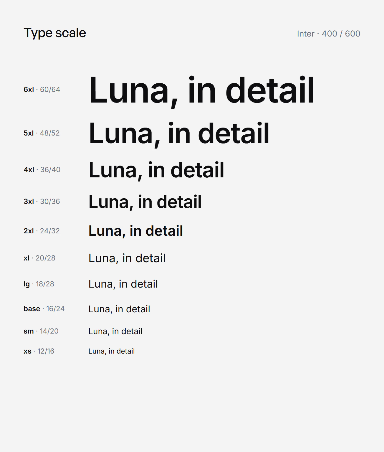
The Luna type scale in Inter, from 6xl at 60/64 to xs at 12/16
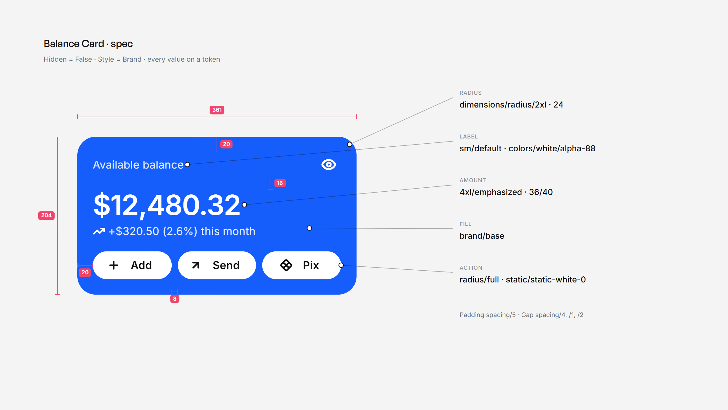
Balance Card spec: dimensions, padding and gaps in redlines, and the tokens behind fill, radius, type and actions
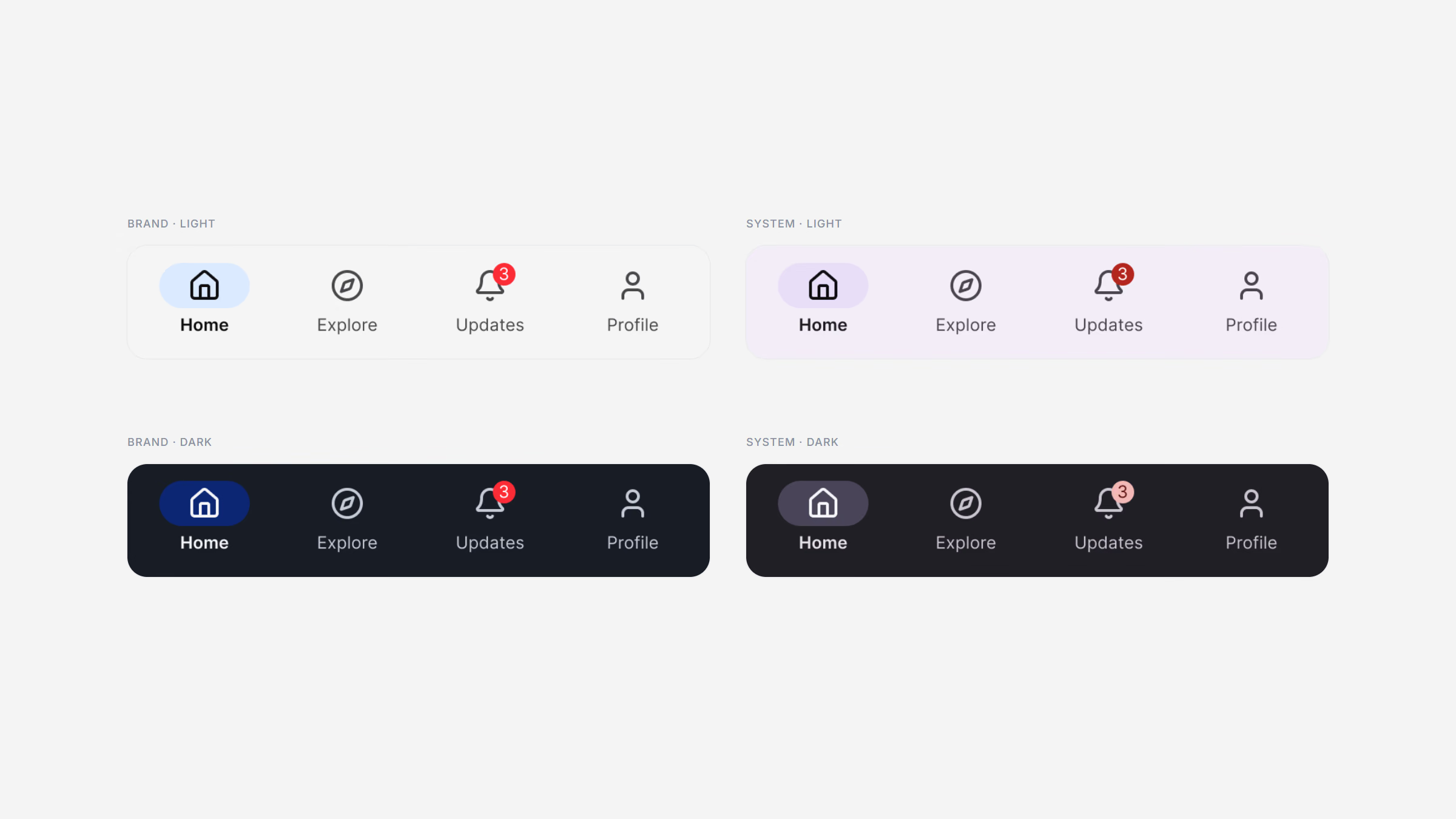
The Material navigation bar in Brand and System modes, light and dark
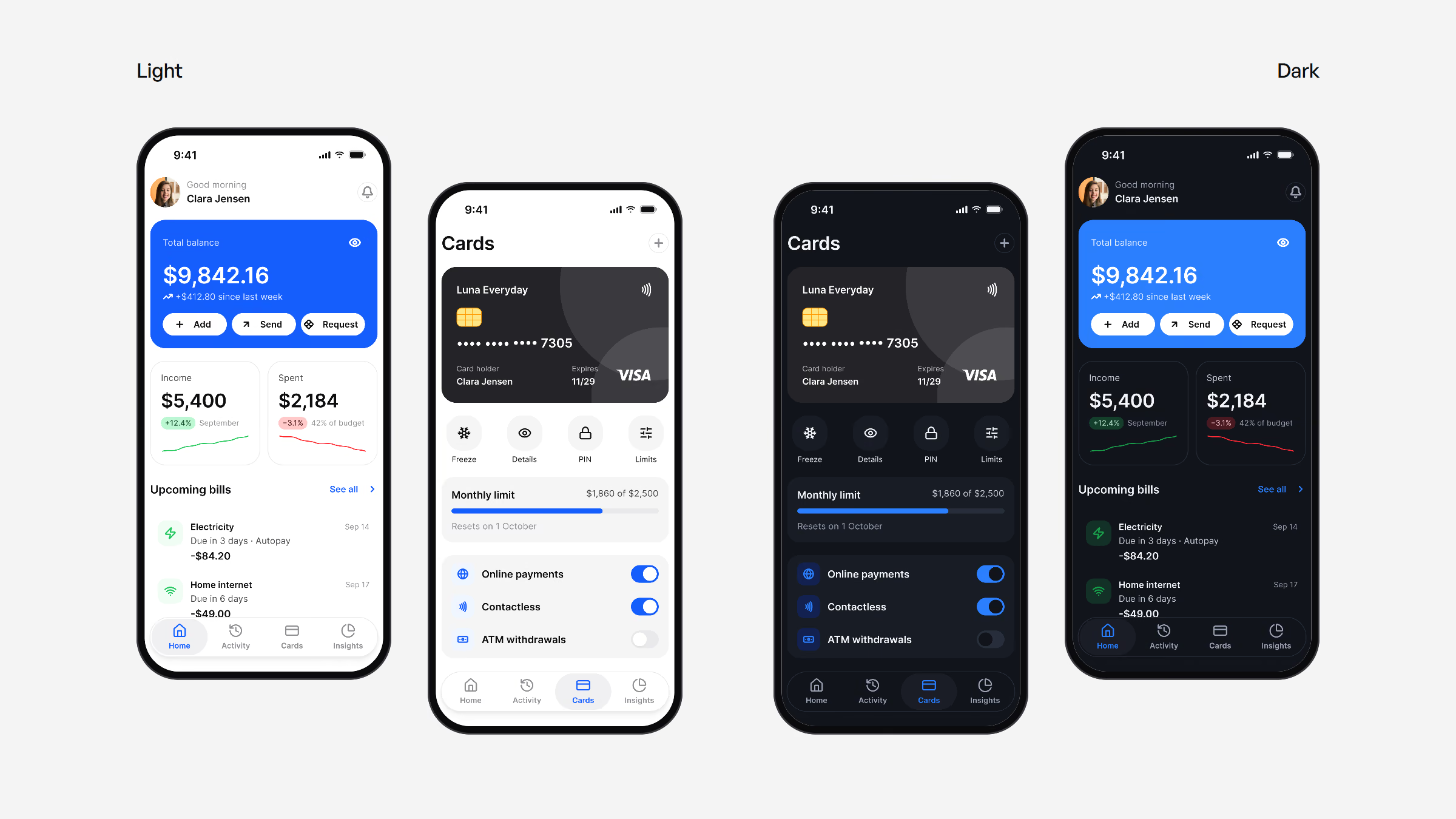
The same Finance instances in light and in dark mode
“A component never names a color. It names a token, the token names a foundation, and the chain runs one way only.”
Luna DS documentation, Read me
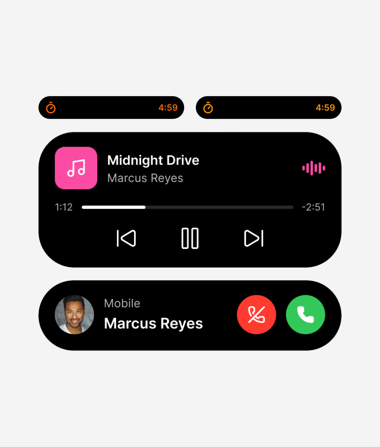
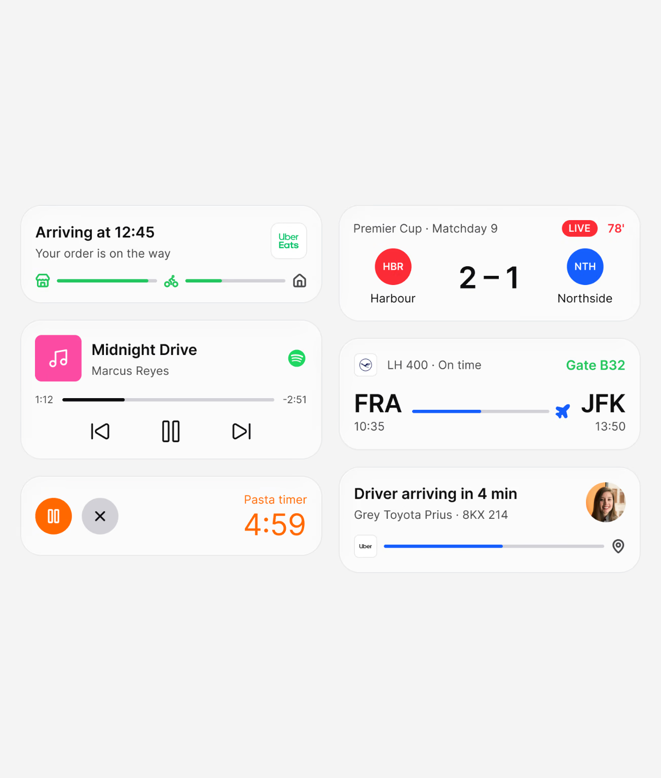
Six Live Activities redrawn in Luna
The Dynamic Island in compact and expanded states, Brand and System

Native patterns

21 Apple and 17 Material 3 patterns are redrawn in Luna geometry. The Platform Bridge maps 112 Apple and Material slots to Luna tokens in Brand mode, or to the platform’s own published values in System mode, so a screen can be checked against the native palette in one switch.
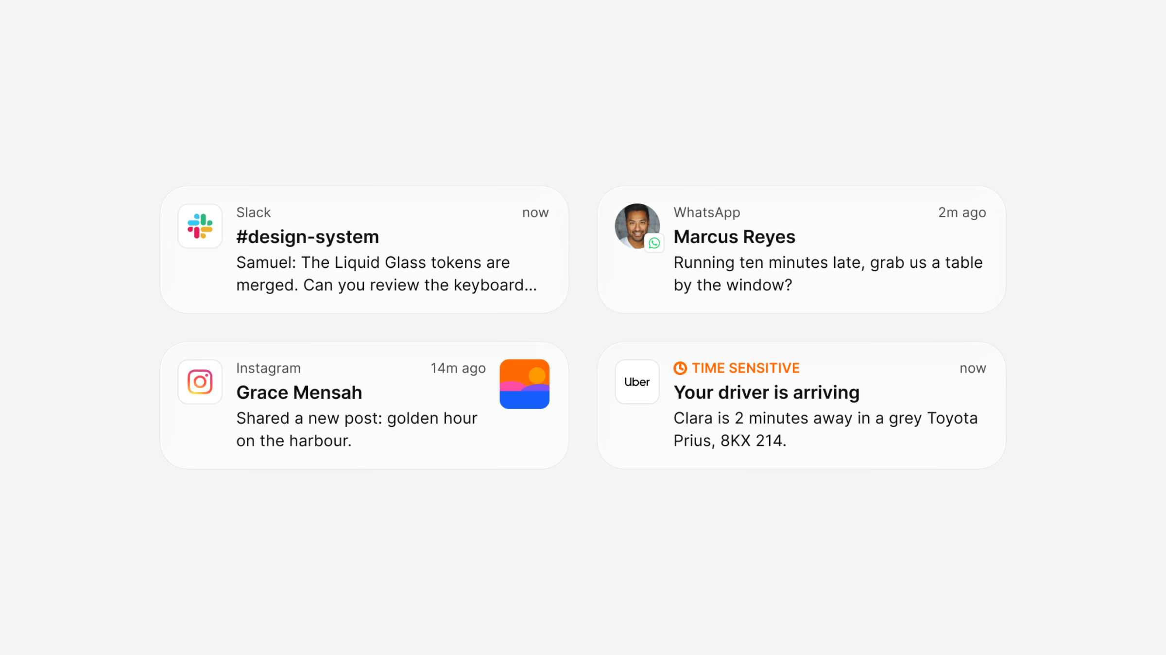
Four iOS notifications redrawn in Luna
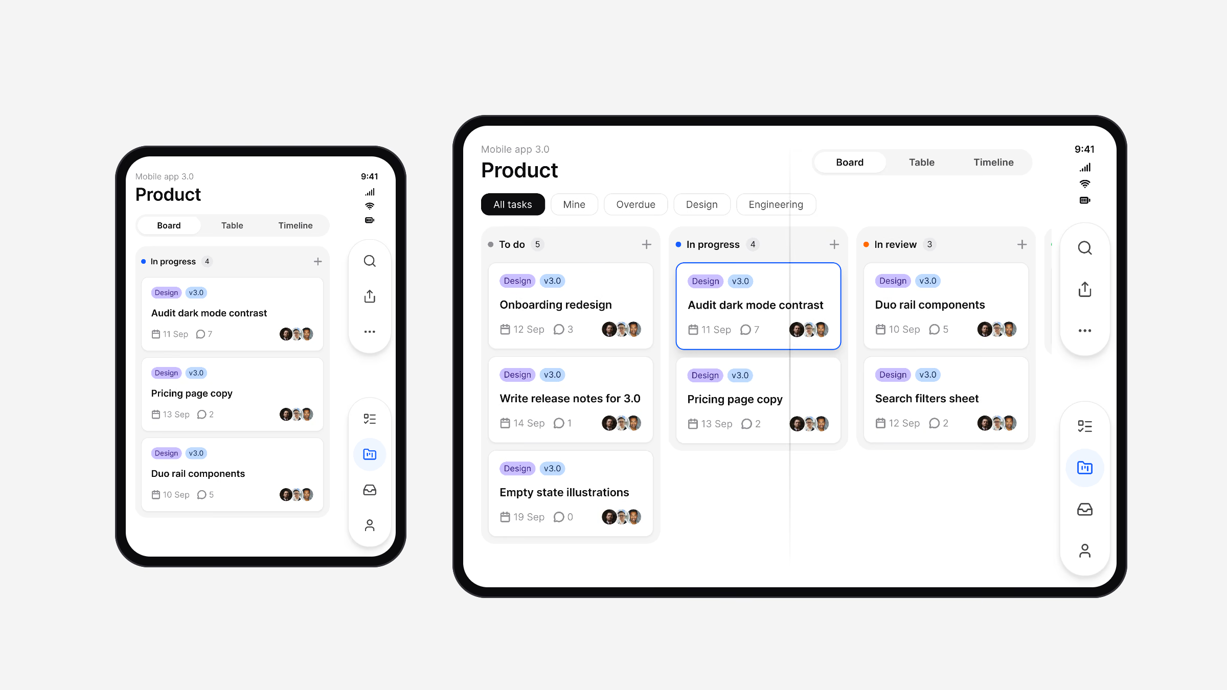
A tasks app on iPhone Duo: the board on the folded outer screen and the full board unfolded

What is in the box

556
Variables in six collections
79
Components, every state on a token
88
App screens in light and dark
0
Dark variants to maintain

What I’d take to the next system

A system is its constraints: no paint styles and no dark variants were deliberate choices, and every shortcut removed was one less place for the system to drift.

Naming tokens the way SwiftUI, Compose, Flutter and CSS read them kept the file and the code describing the same thing, and complete app screens built only from instances proved the system faster than any documentation page could.