Wireframes
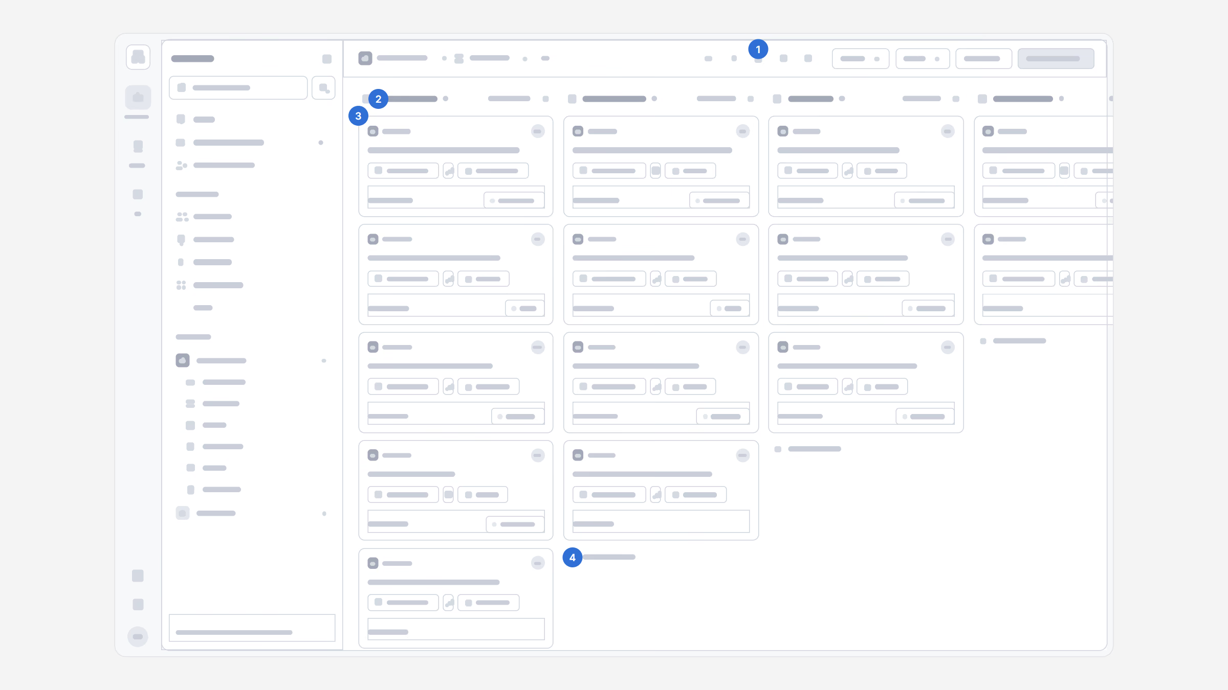
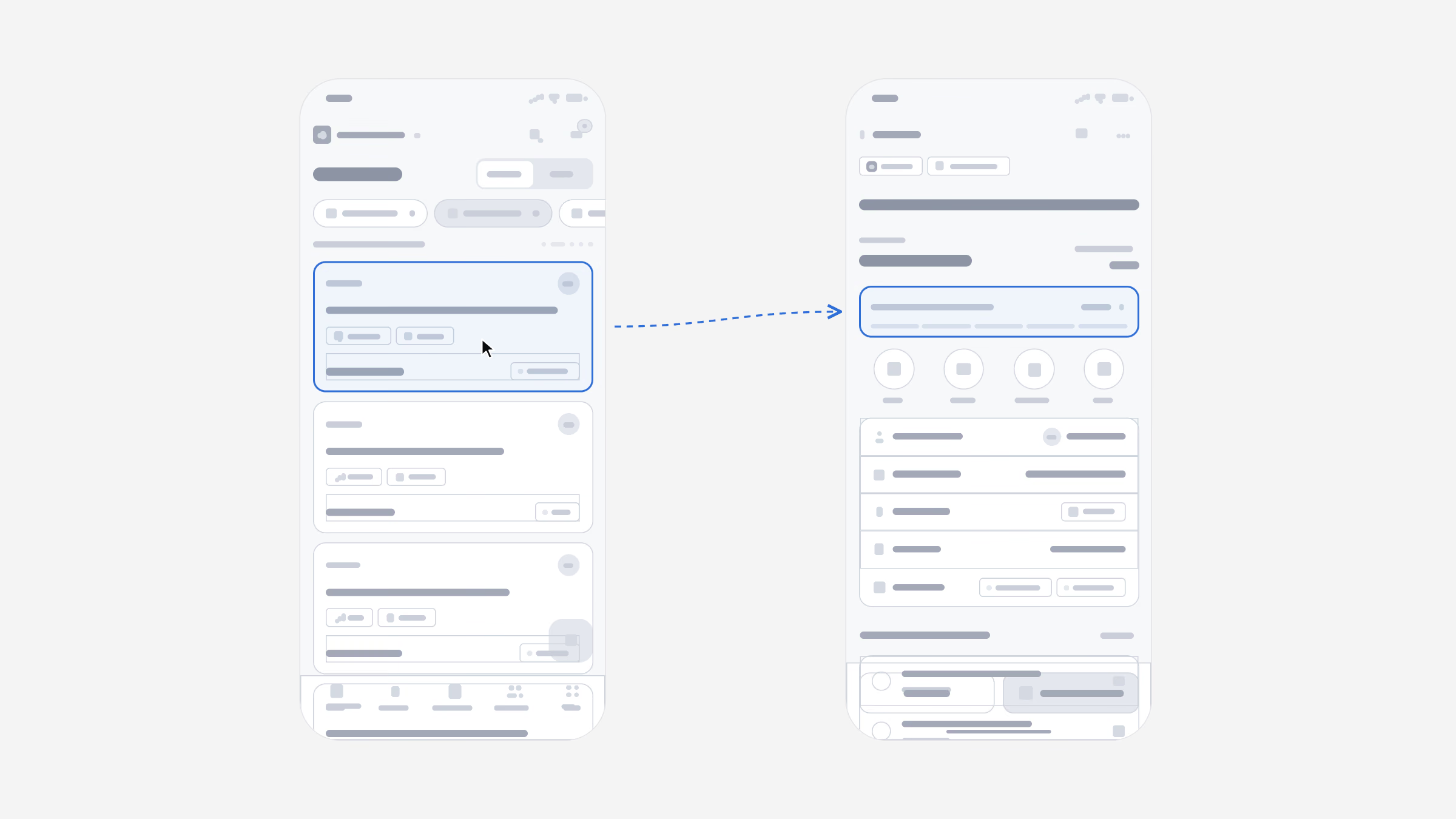
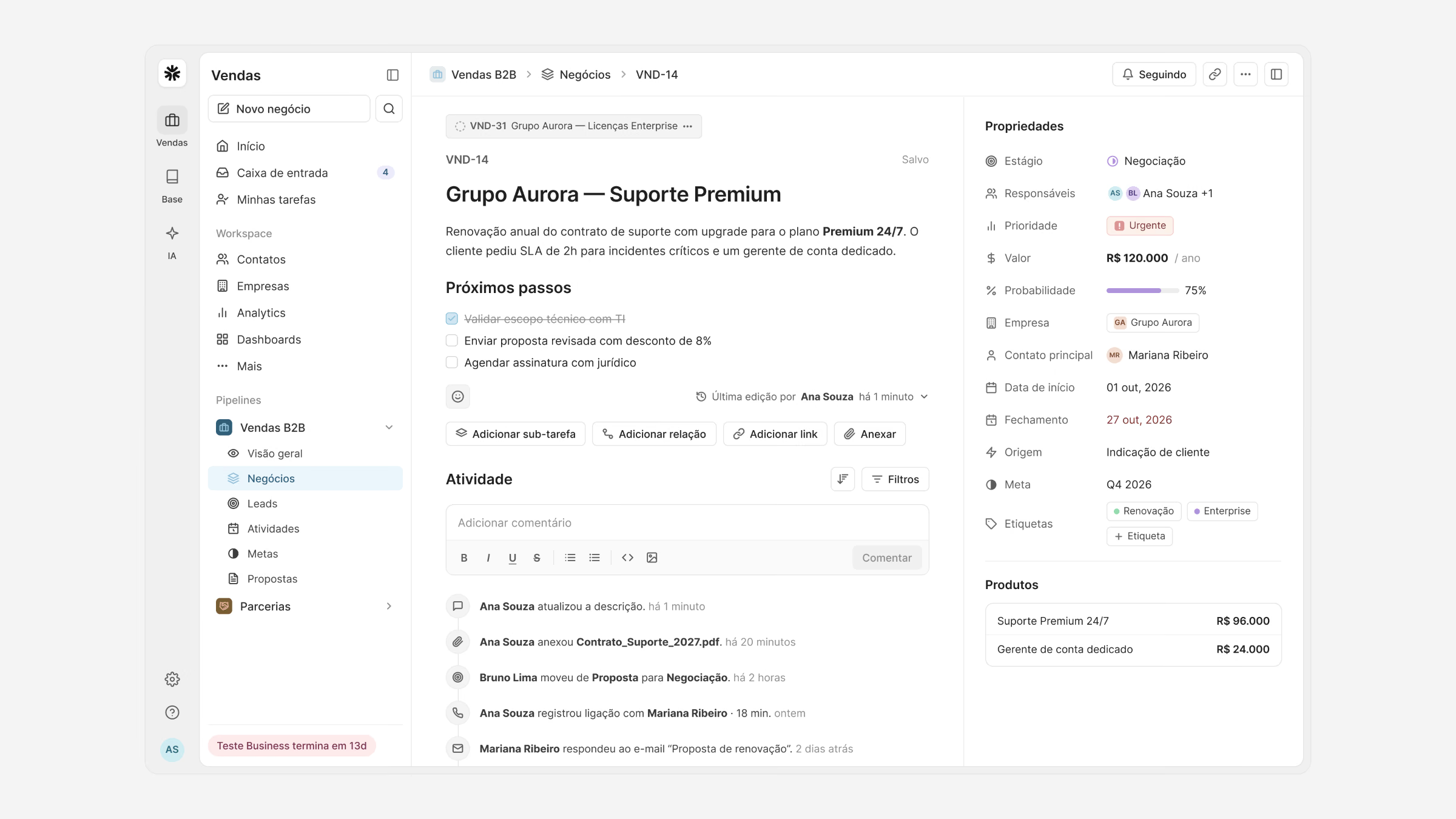
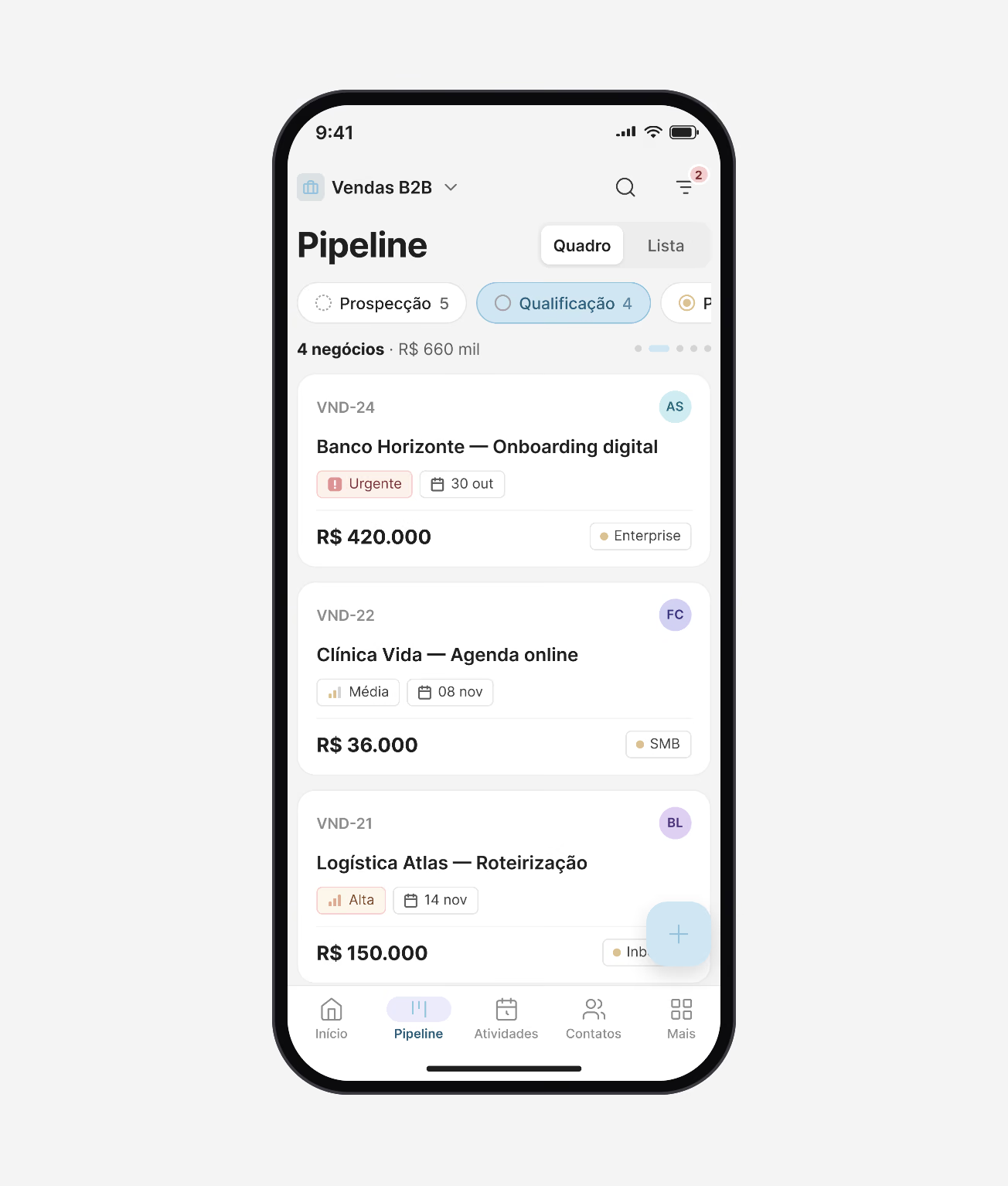
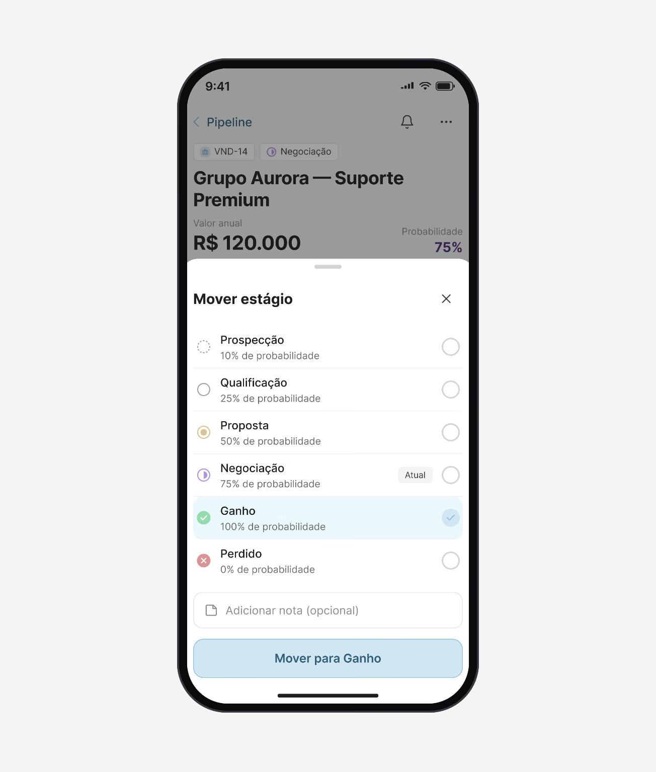
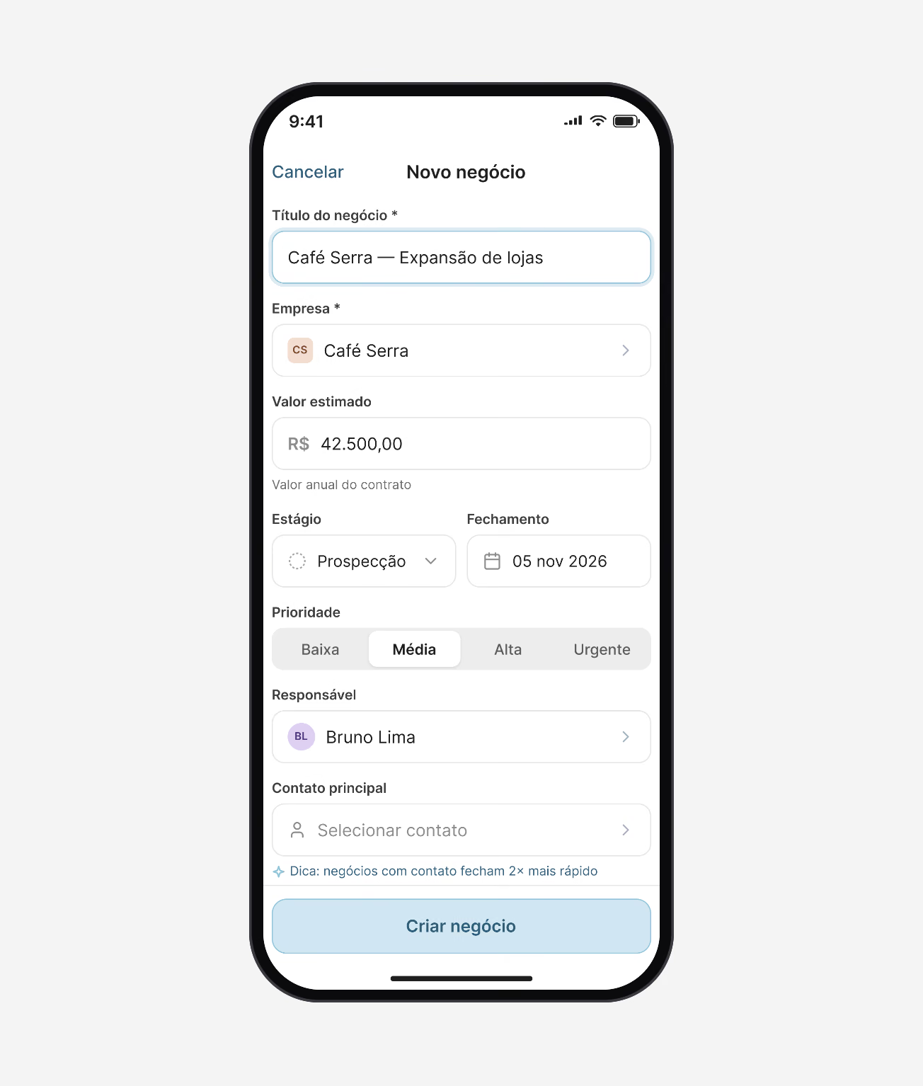
Before any visual design, the two core flows were laid out in low fidelity on the real layout: the pipeline board on the web, and the path from a deal to its next stage on the phone.
Four decisions carried the board: (1) one switcher for board, list, calendar and timeline over the same deals; (2) the count and total value in every stage header; (3) cards that show stage, priority, close date, value and source at a glance; (4) adding a deal right where it belongs.
Pipeline
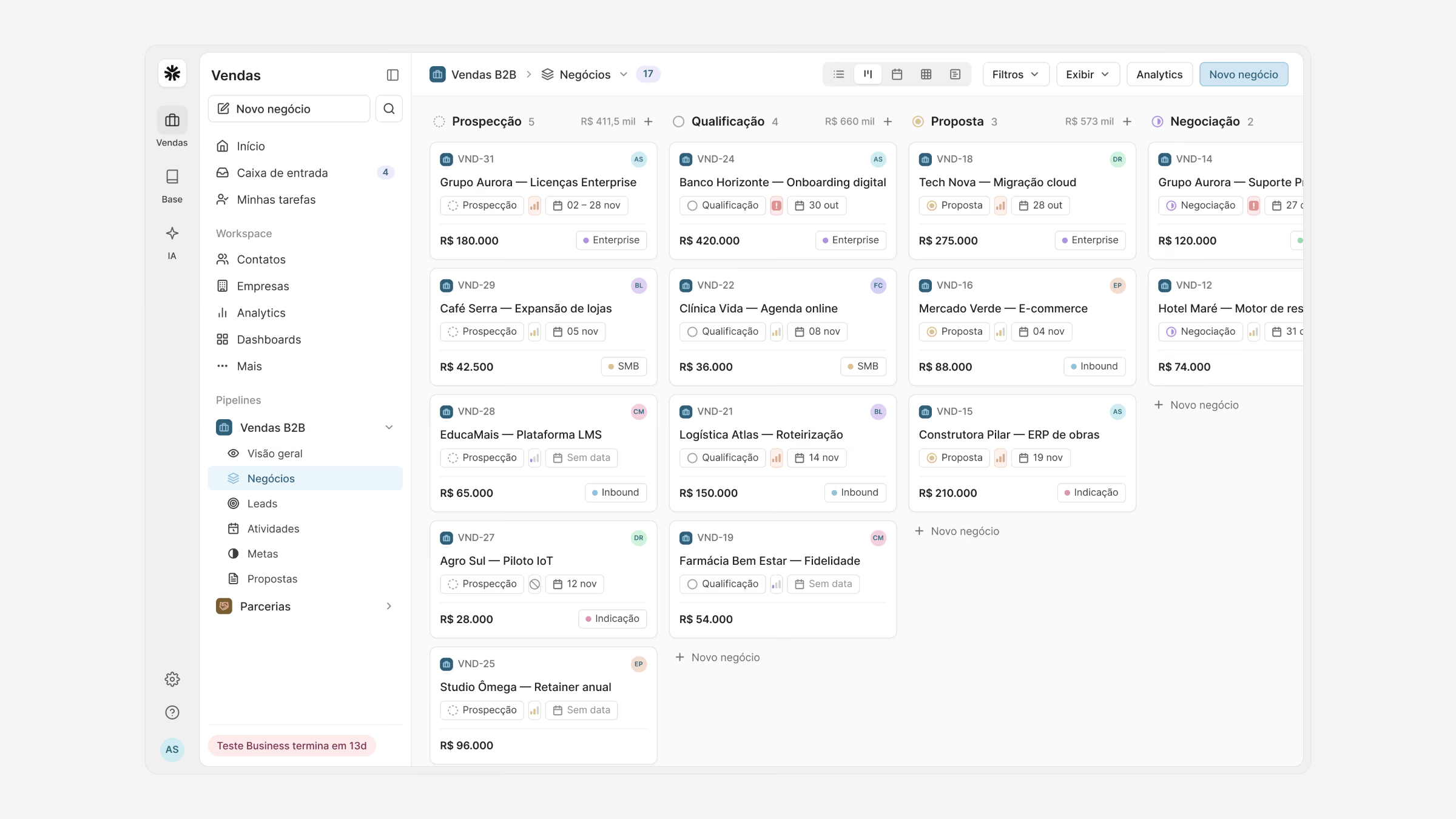
The board is where the day starts. Deals are dragged between stages, and the same deals open as a list, a calendar of closing dates or a timeline, without losing the filters.
Each card answers the questions a manager asks in a pipeline review, so the weekly review takes minutes instead of an hour.
“I update deals in the car park between meetings now. Before, it all waited until Friday, and by then I had forgotten half of it.”
Web and mobile
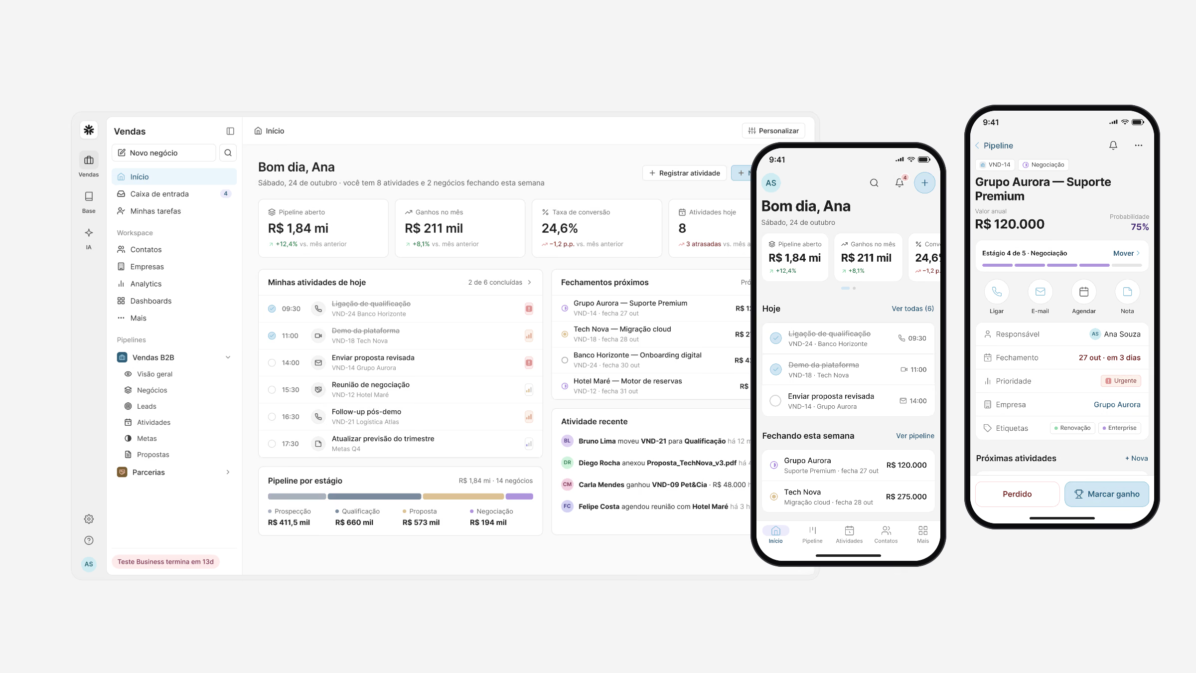
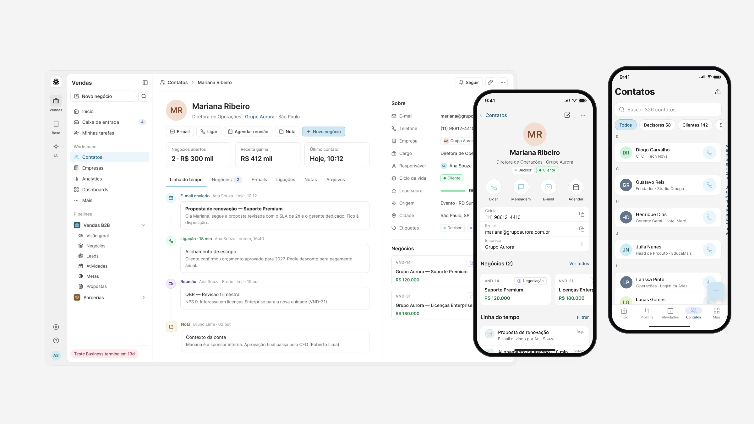
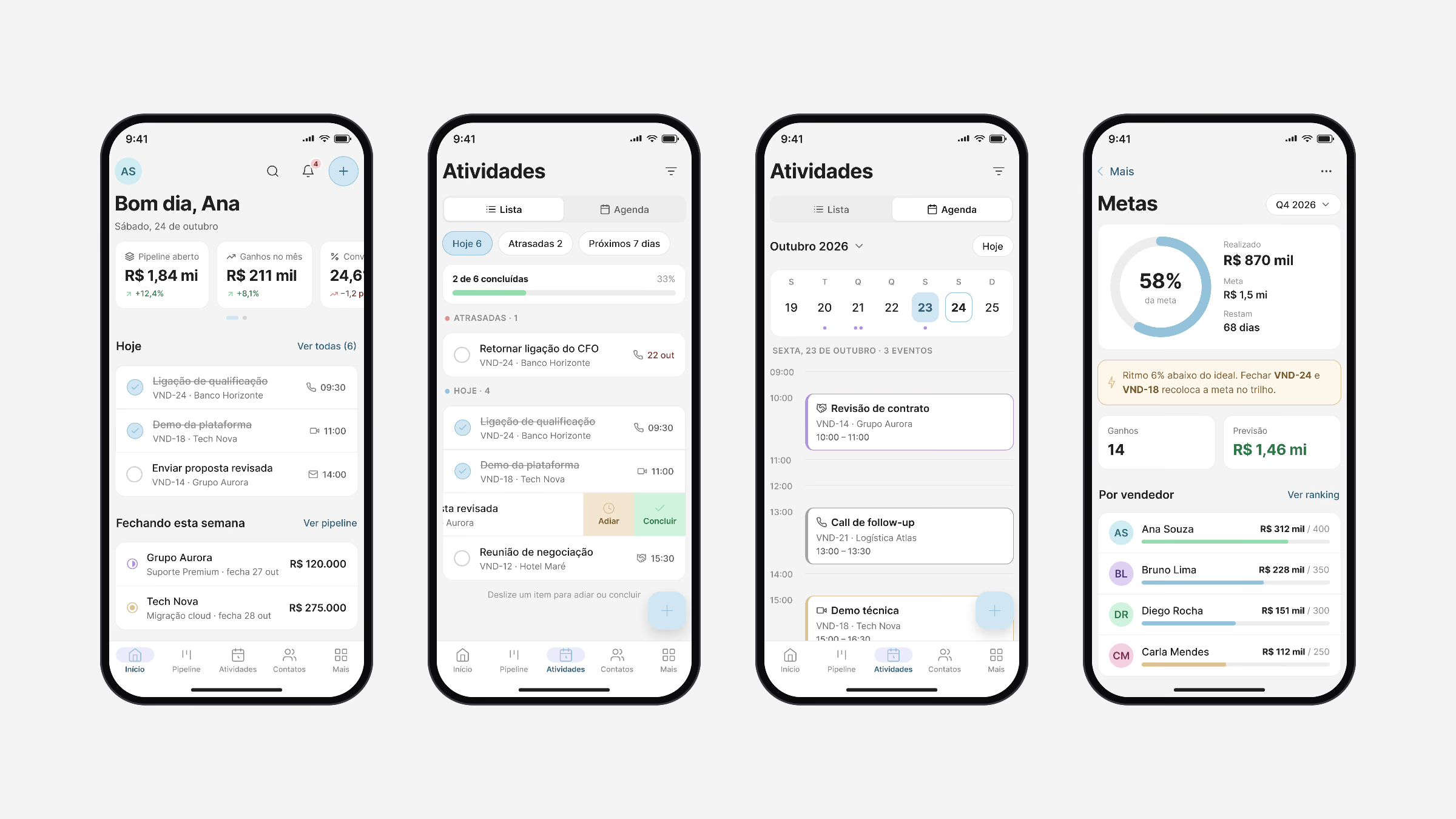
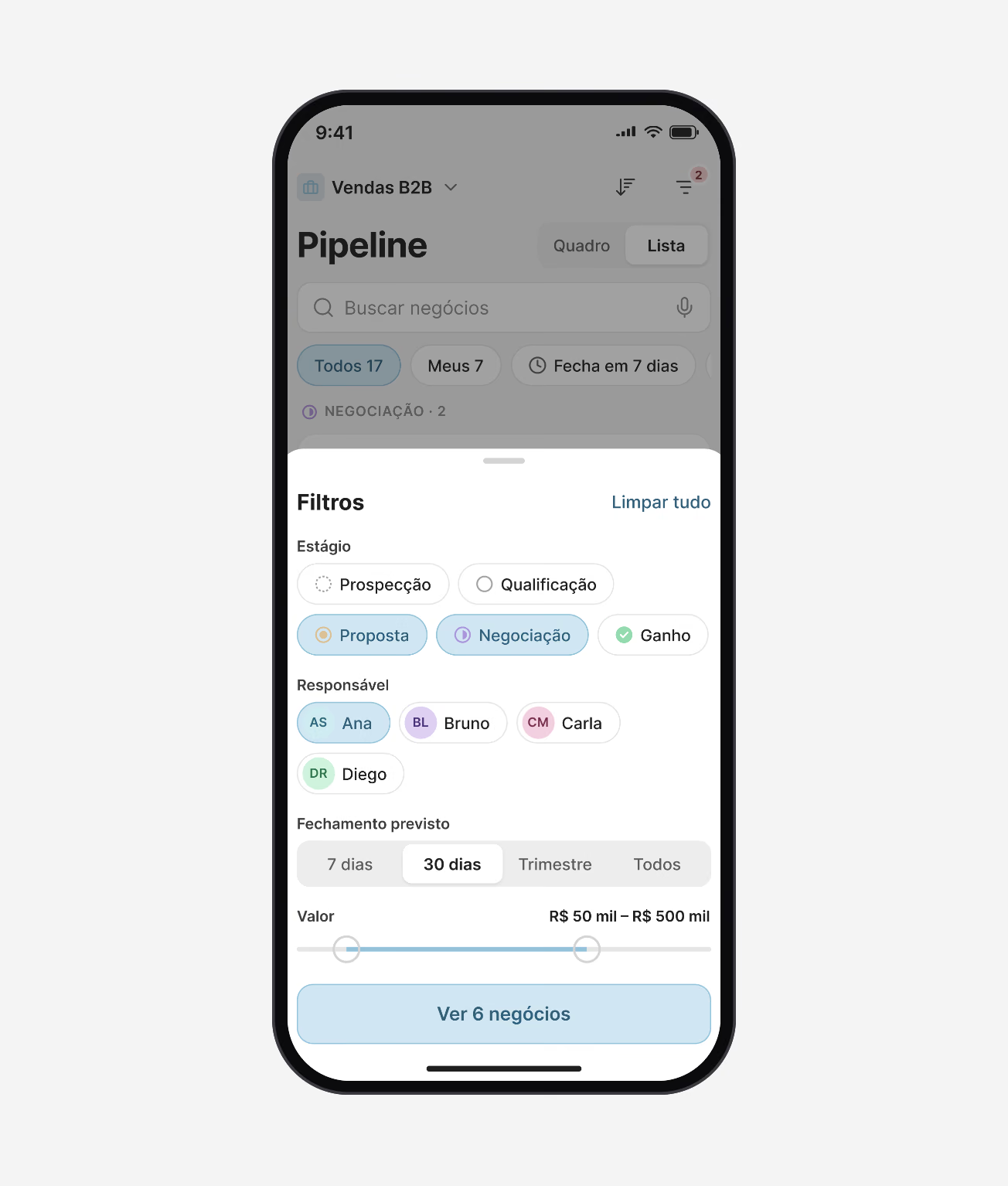
Mobile is not a smaller web app. It keeps what matters between meetings: today’s activities, the deals closing this week, moving a stage, logging a call, and filters that fit a thumb.
Both apps share one component library and the same tokens, so a deal, a contact or a goal looks and behaves the same everywhere.
Insights
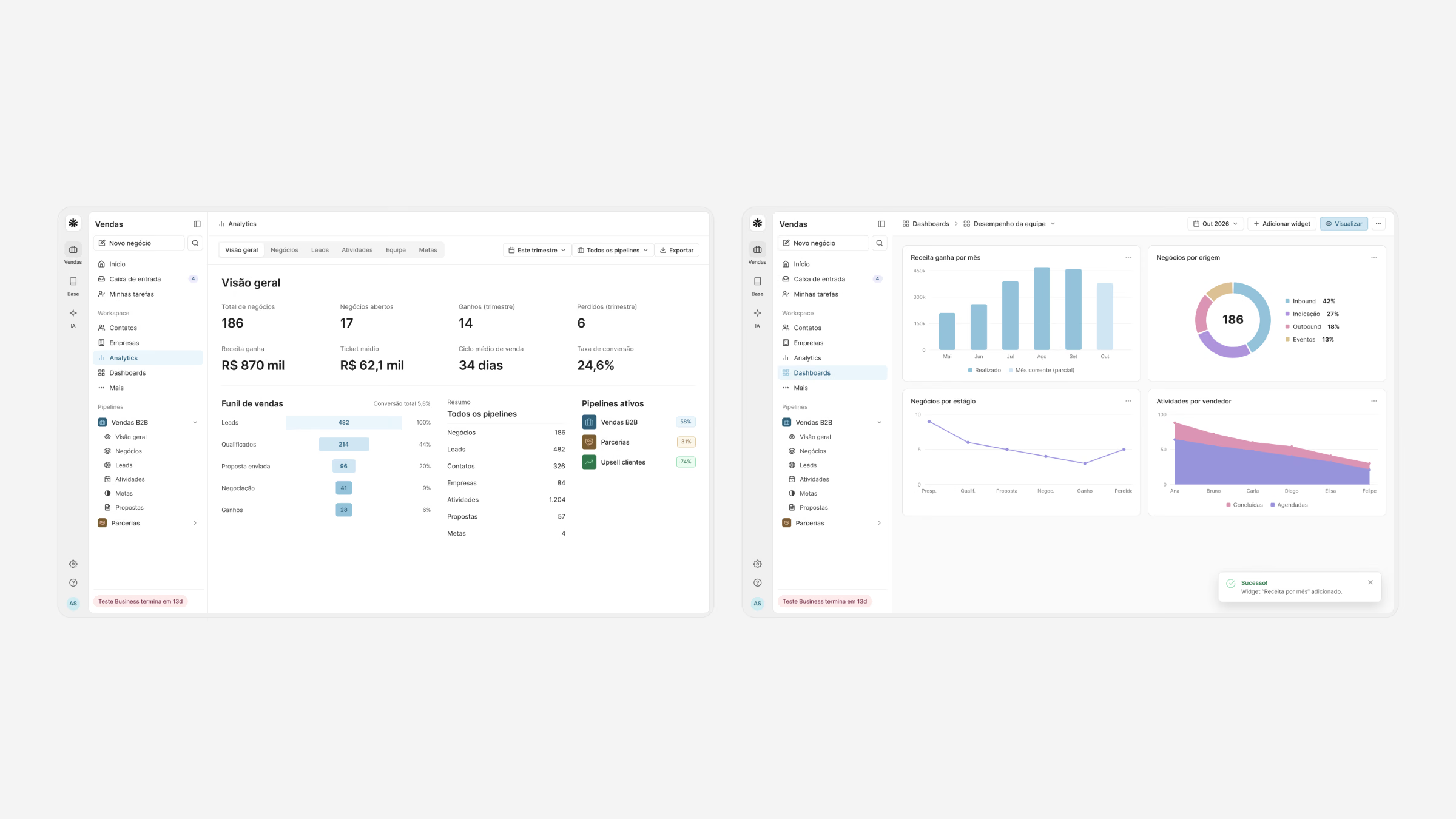
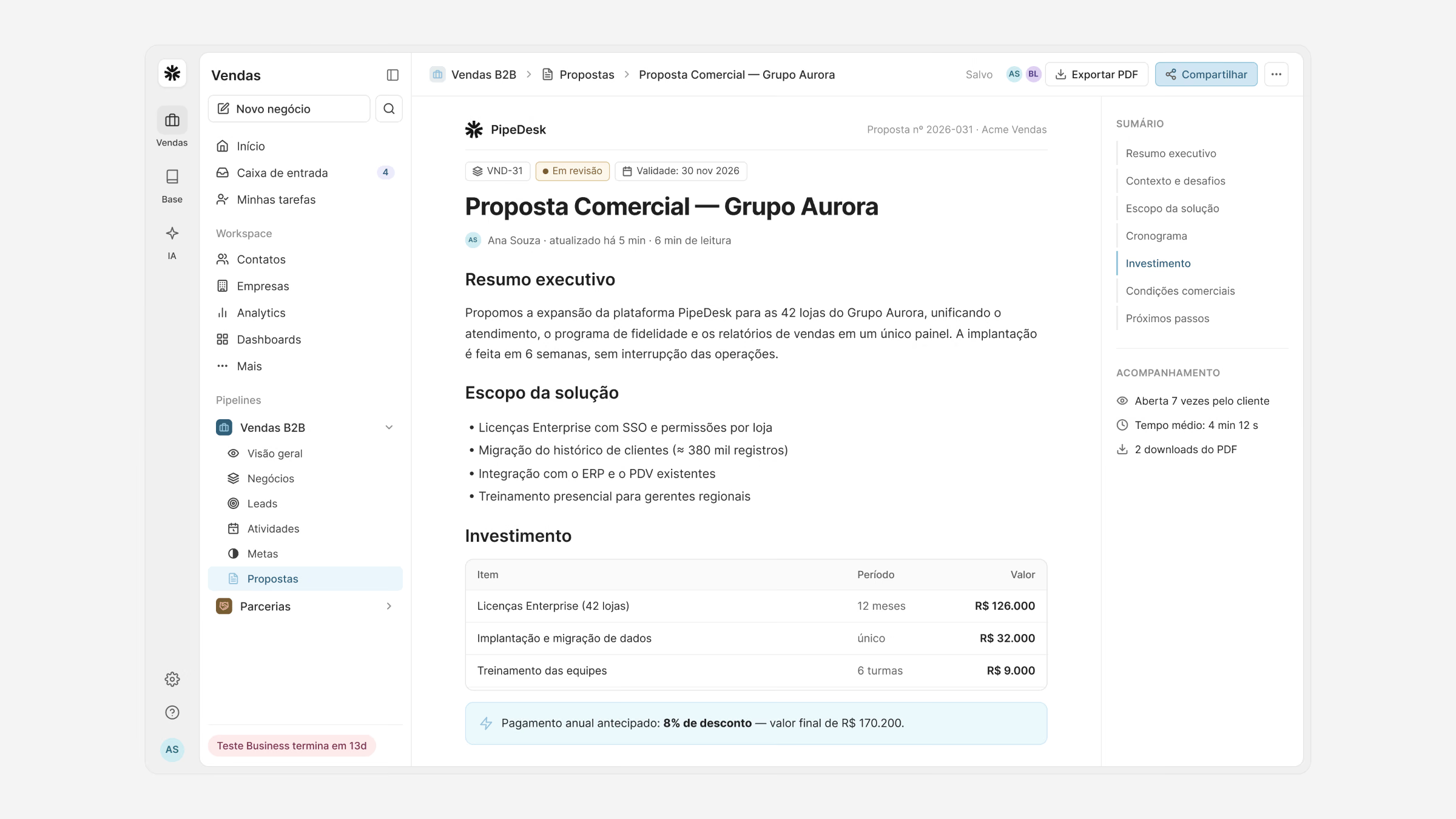
Analytics, team dashboards and goals turn the pipeline into a forecast managers can trust, and proposals are generated from the deal itself, with products, pricing and terms in one document.
Pilot results
- −38%
- Time to update a deal
- 83%
- Deals with a next step scheduled, up from 61%
- 3.2×
- Pipeline updates made on mobile
- 84
- SUS usability score
What I learned
Speed is the feature. In a CRM, every second saved on an update is data that finally gets in, and better data is what managers are really paying for.
Designing web and mobile together, from the same model, kept the two from drifting apart and made the phone part of the system, not an afterthought.
 Magnum SCD
 Gamma
 Luna