Magnum SCD
A digital account for the mobile-first generation
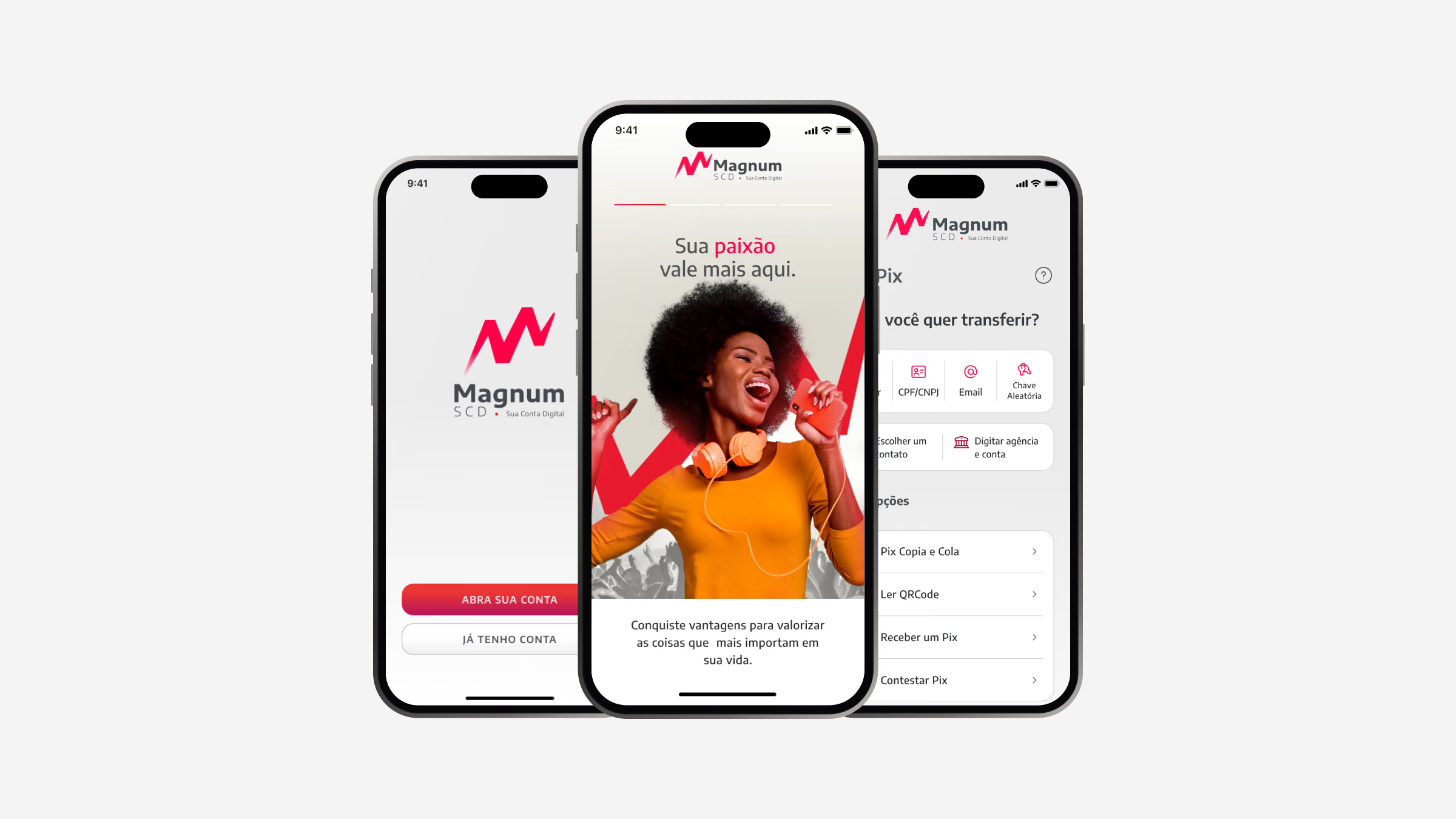
The fintech market in Brazil is notoriously rigorous: dominated by traditional banks and contested by digital-native neobanks. Even with so many options, people still navigate convoluted interfaces full of hidden fees and confusing requirements.
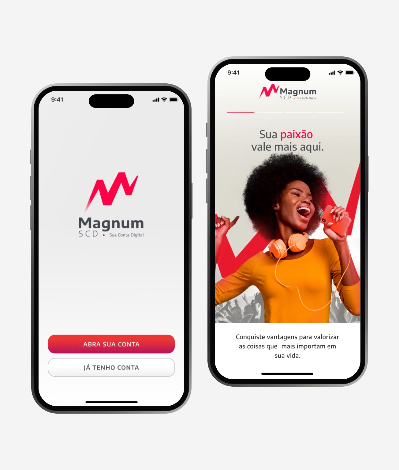
Magnum SCD was conceived at the intersection of transparent financial agility and emotional connection. Its promise, “Here your passion is worth more”, called for design sprints to unpack the industry baseline, define the product foundation, prototype fast and ship.
- UX research
- UI design
- Prototyping
- Design system
Process
From problem to delivery, step by step.
06stages documented in this case
- 01Discover
Market research across Nubank, Banco Inter, C6 Bank and Mercado Pago compared value propositions, UX patterns, frictions and support.
- 02Design
Mid-fidelity wireframes came first, then a high-fidelity UI with a bold identity and a clear hierarchy.
- 03Pix, end to end
Pix is the most used feature of the account, so it became the reference for every other flow.
- 04Business onboarding
Opening a business account asks for much more than a personal one: company data, partners, legal representatives and documents.
- 05Design system
App, internet banking and back office share one design system.
- 06What I learned
Friction makes better interfaces: every bureaucratic click we removed came from listening to where people gave up.
Discover
Market research across Nubank, Banco Inter, C6 Bank and Mercado Pago compared value propositions, UX patterns, frictions and support. Sketching and whiteboard iterations consolidated the MVP into four critical journeys.
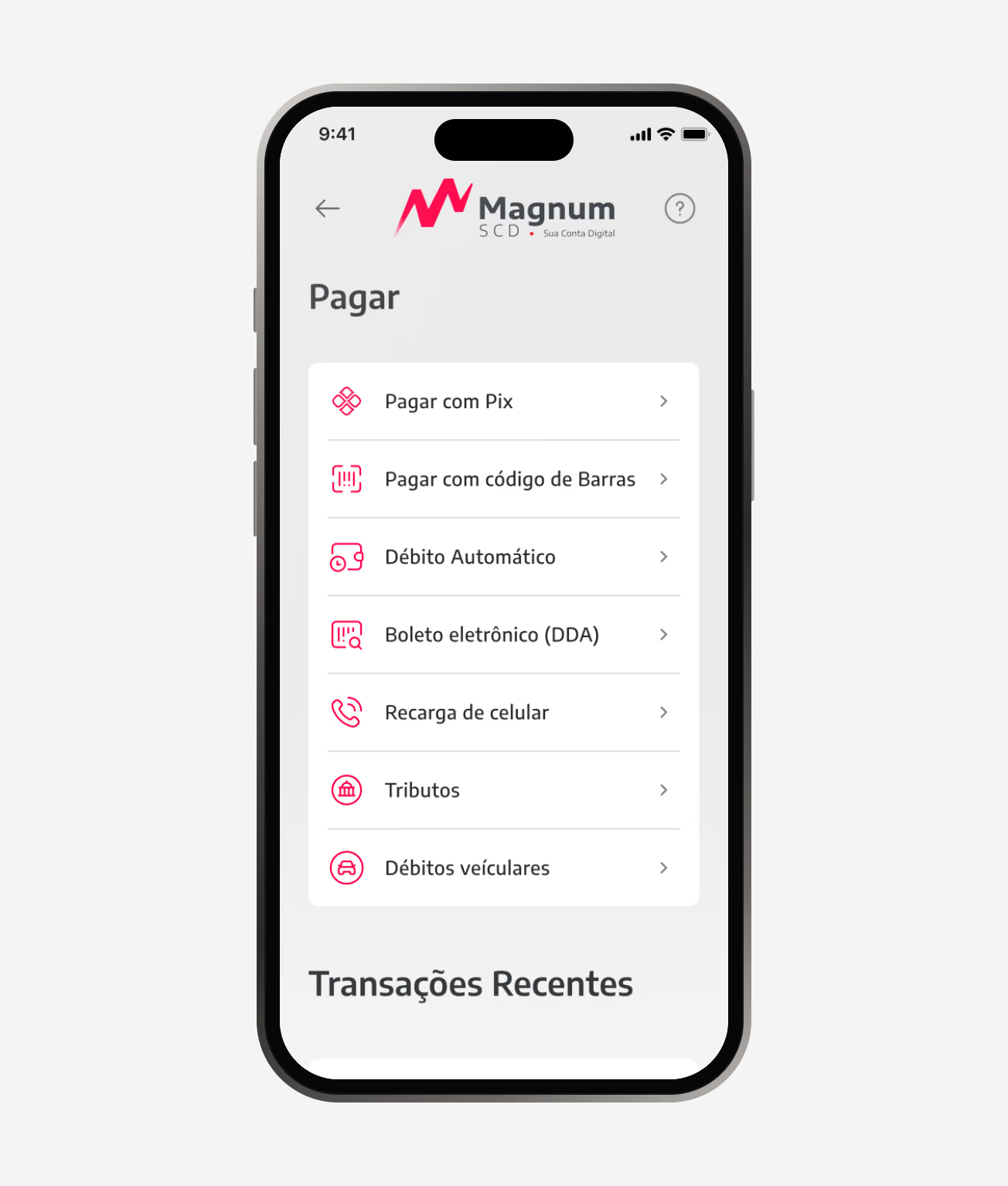
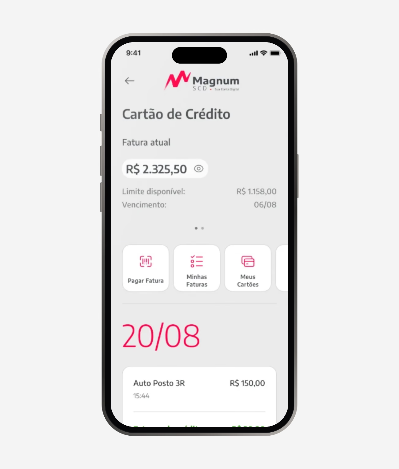
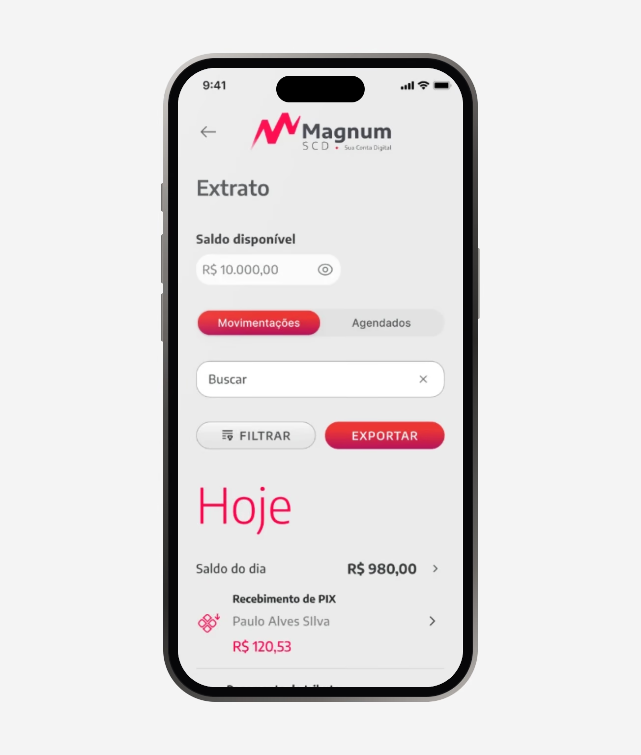
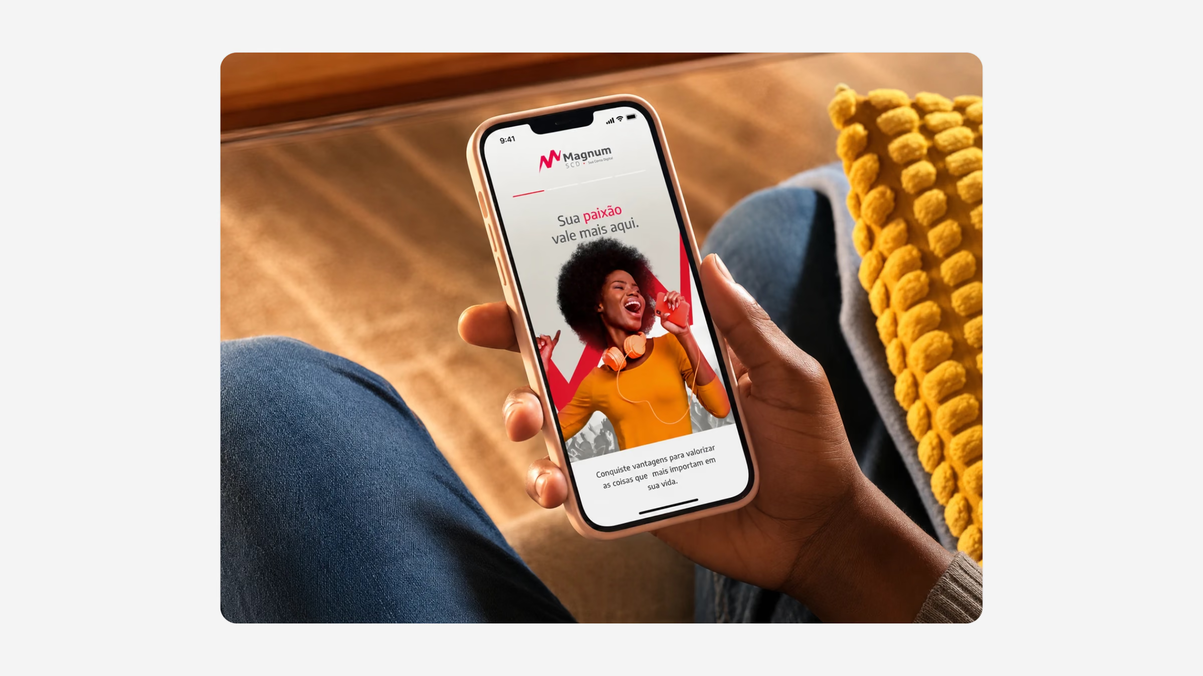
Seamless onboarding in under three minutes with OCR and facial biometrics, a smart dashboard that groups expenses automatically, instant transfers on a Pix-first architecture, and benefits connected to the user’s passions.
Here your passion is worth more.
Magnum SCD brand promise
Design
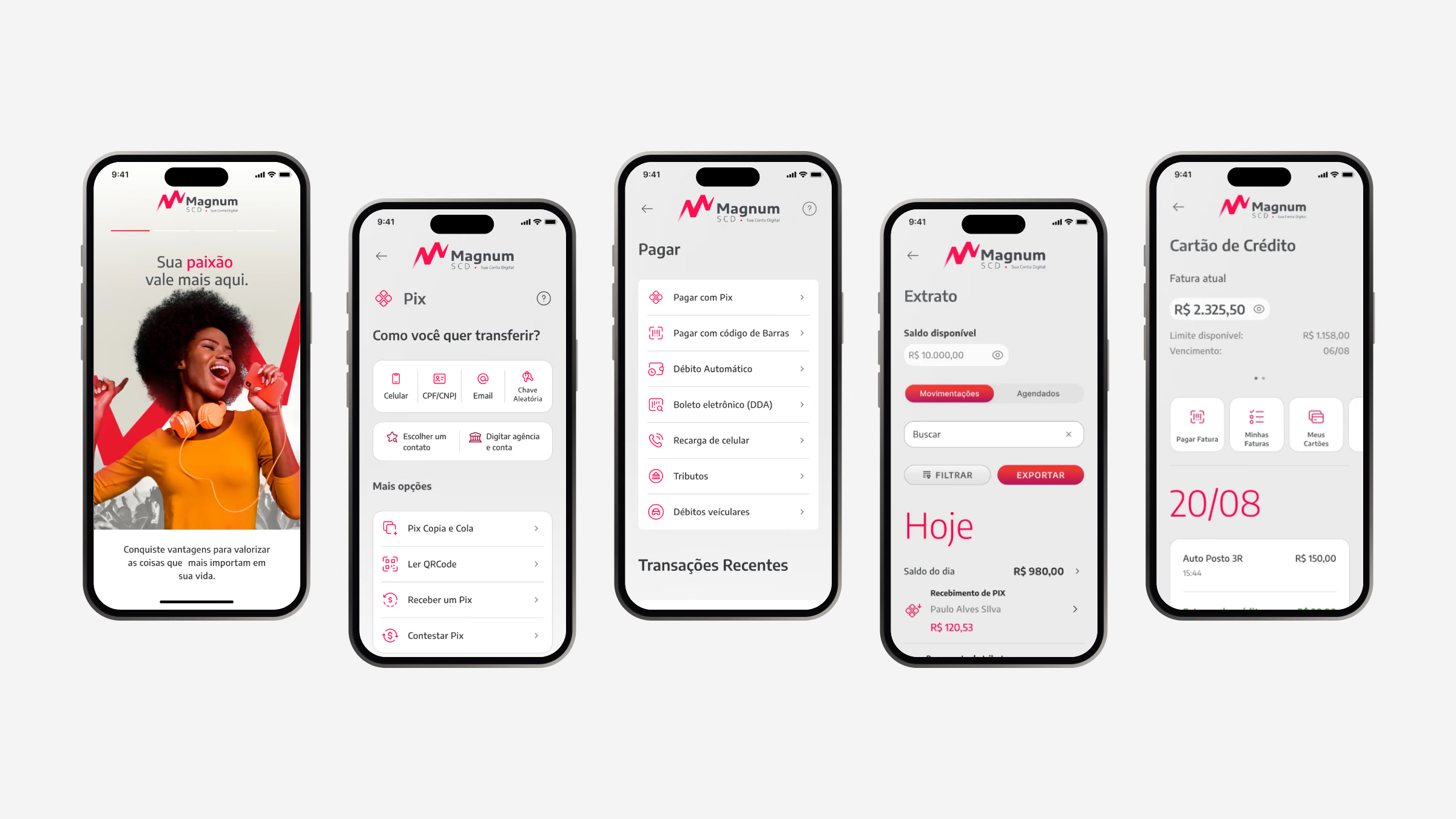
Mid-fidelity wireframes came first, then a high-fidelity UI with a bold identity and a clear hierarchy. The goal was to remove cognitive noise: no redundant menus, no excessive gradients, just clear transactional flows.
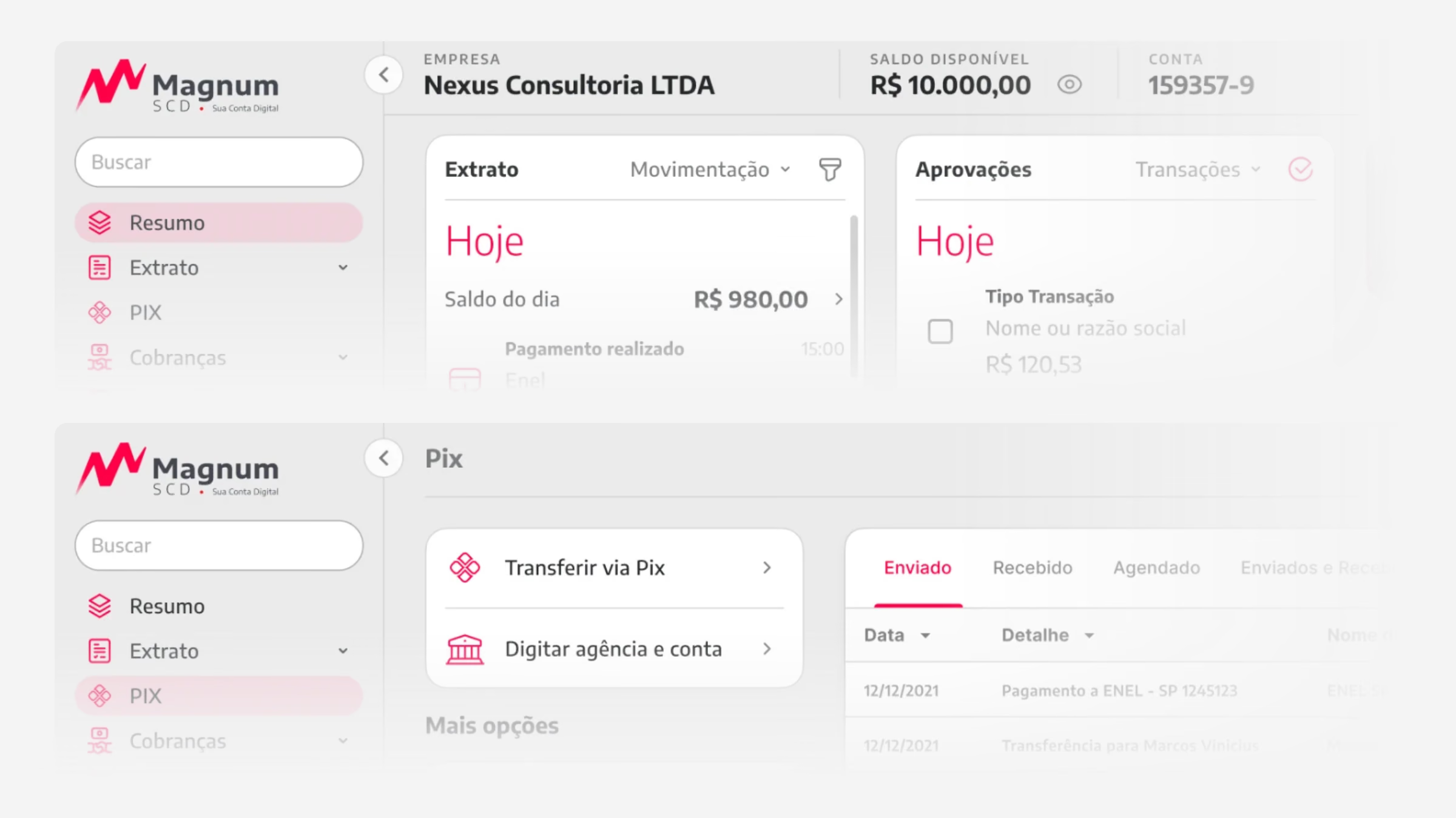
The same patterns carry over to internet banking, so a customer moving from phone to desktop finds the statement, Pix and payments exactly where they expect them.

Pix, end to end
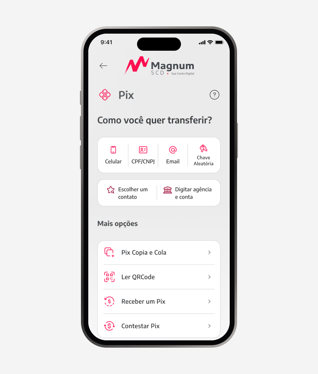
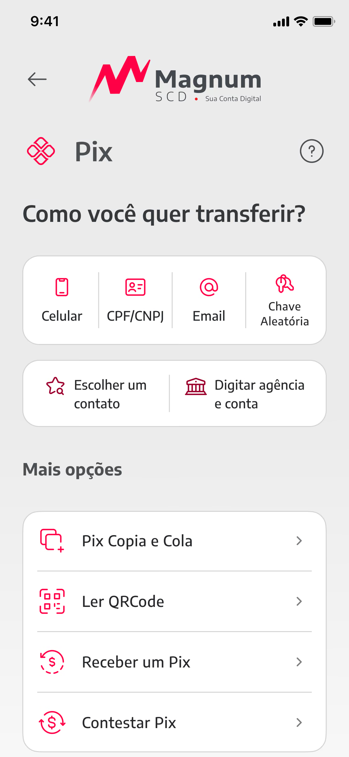
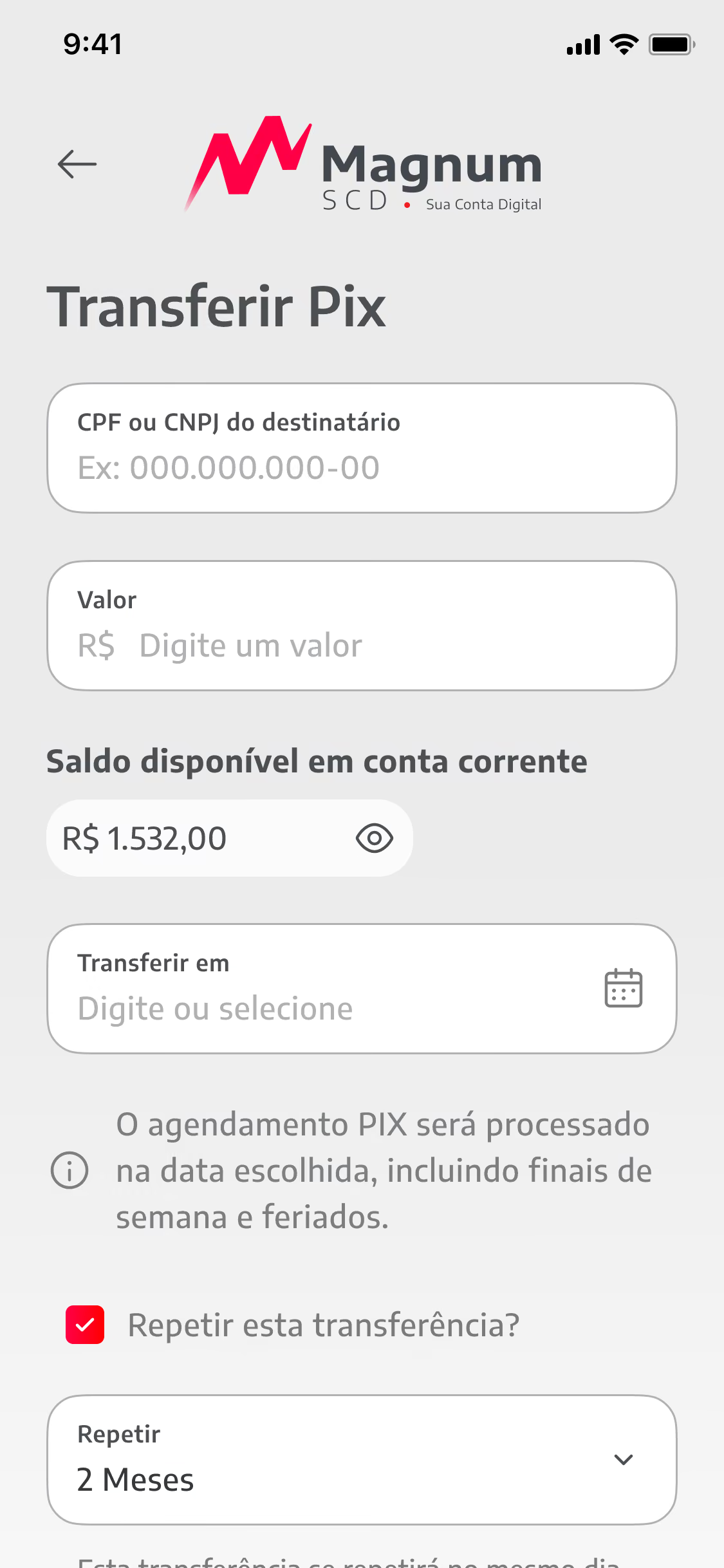
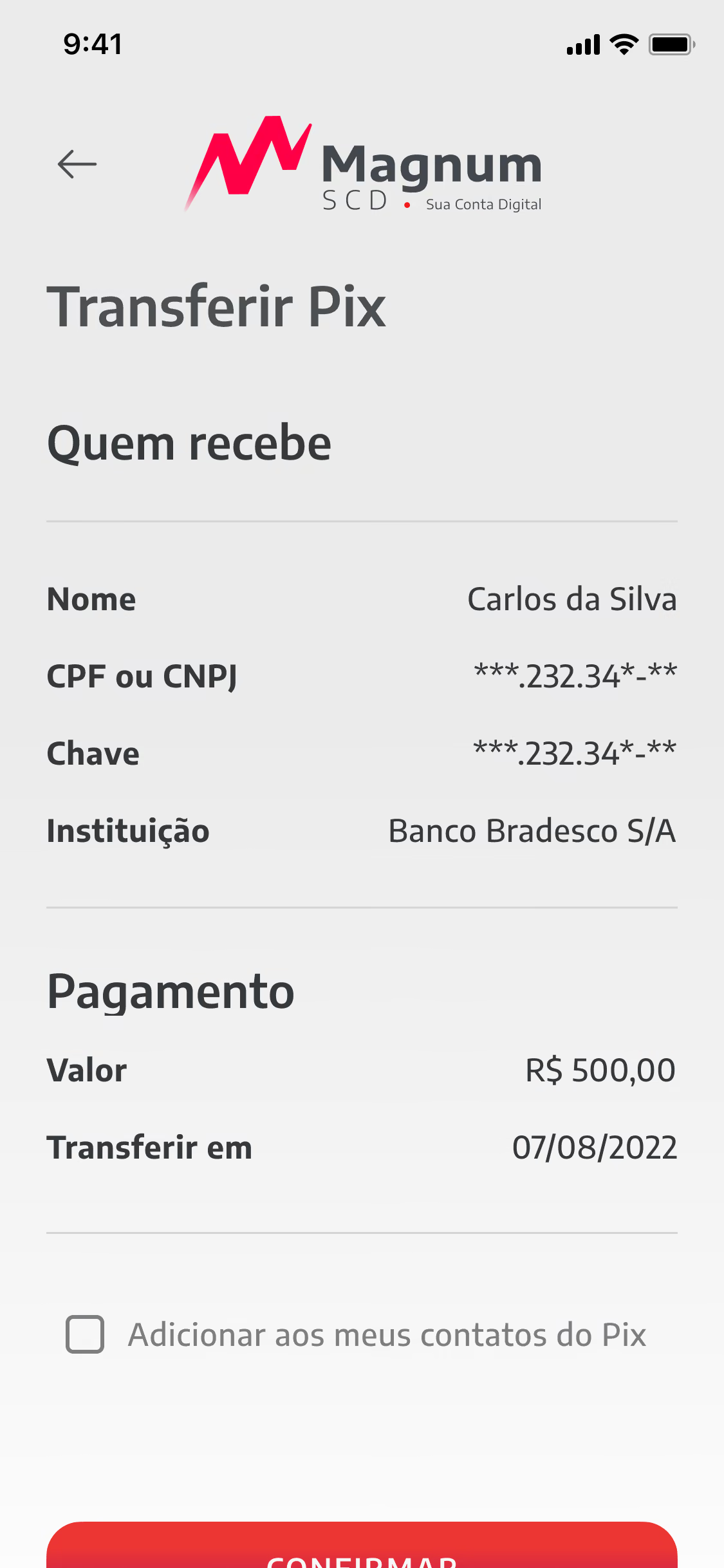
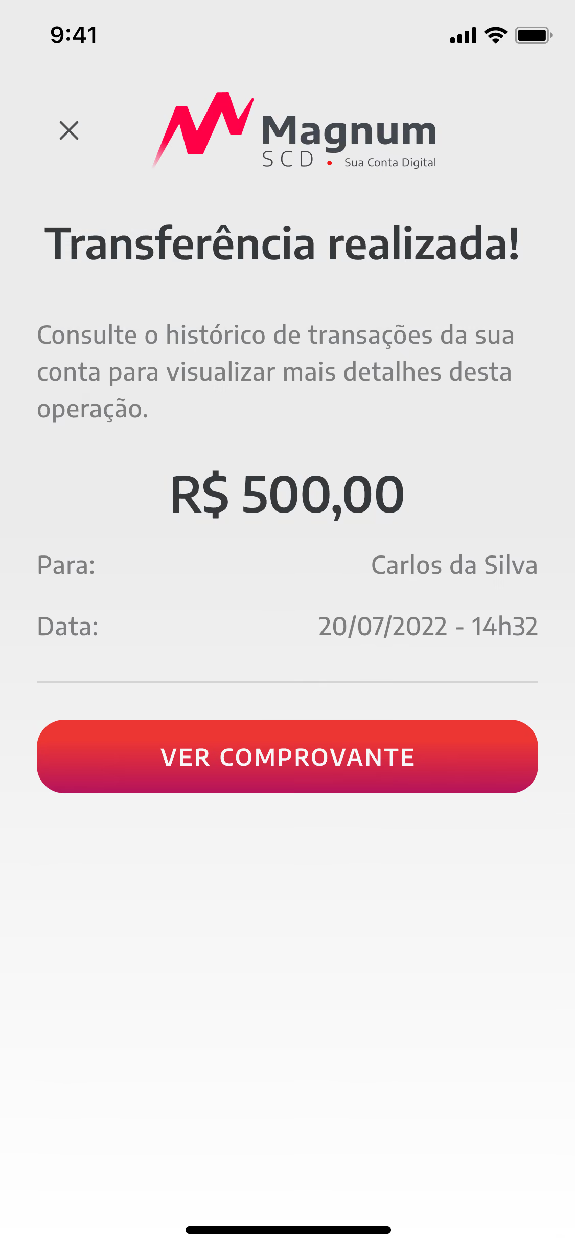
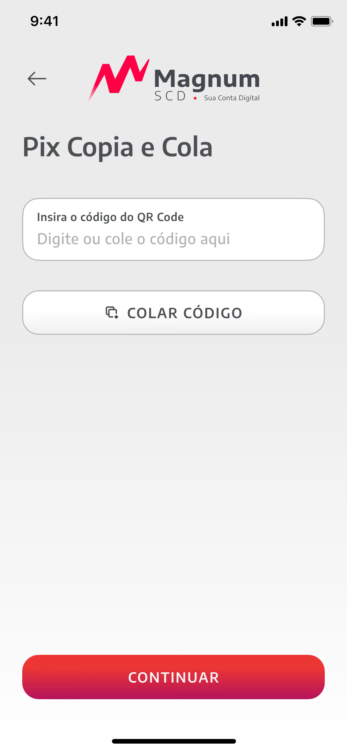
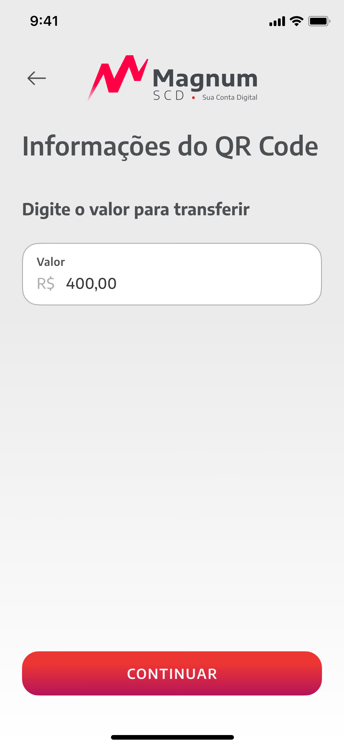
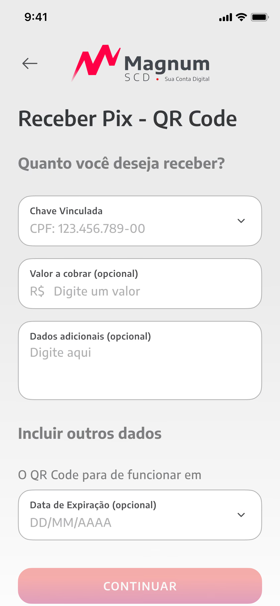
Pix is the most used feature of the account, so it became the reference for every other flow. I mapped each way of paying (key, copy and paste, QR code, branch and account) and designed them on a single structure: who receives, how much, when, confirm.
The same care went into what surrounds the transfer: limits the customer can adjust, Pix Automático for recurring payments and the dispute flow (MED), written in plain language for a moment that is usually stressful.

Business onboarding
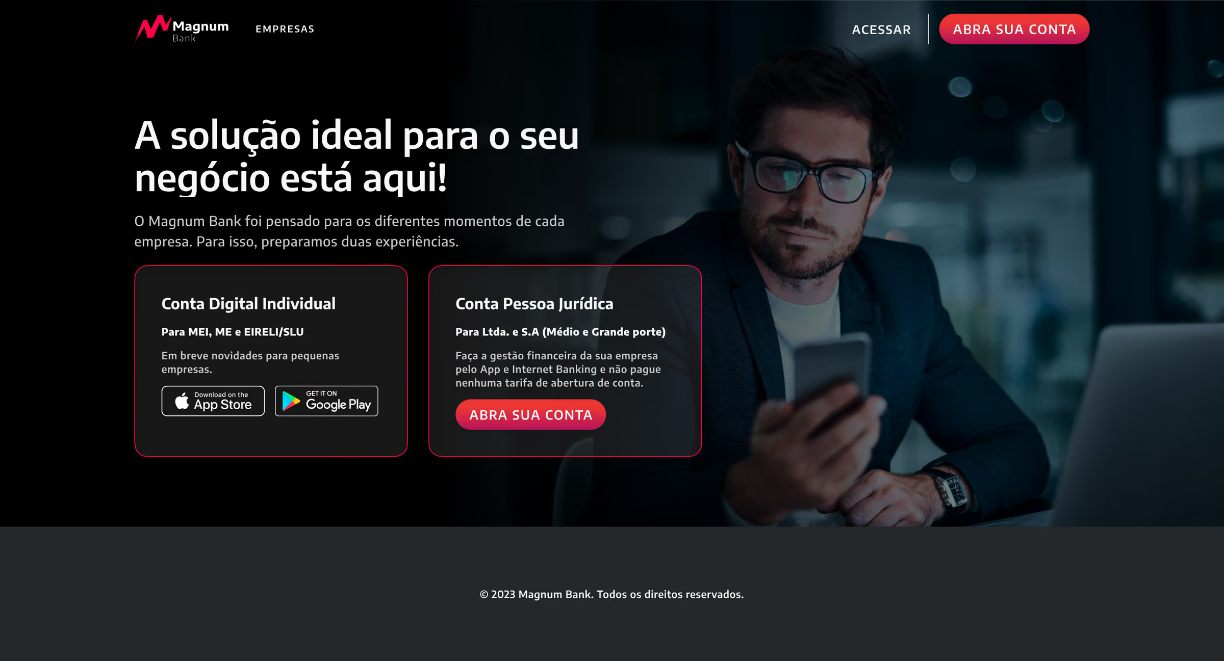
Opening a business account asks for much more than a personal one: company data, partners, legal representatives and documents. I broke the journey into six short steps with visible progress, so the applicant always knows what is left and can stop and come back.
Each step validates as the person types and explains errors where they happen. The partner step shows the percentage of ownership already registered, which removed the most common reason for incomplete applications.
Design system
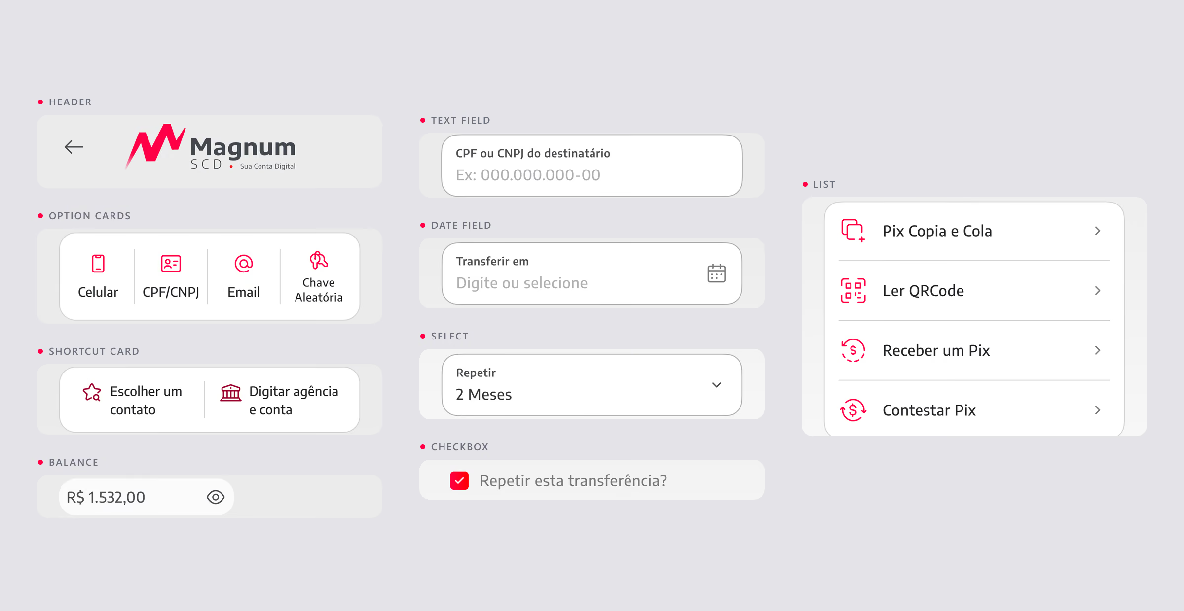
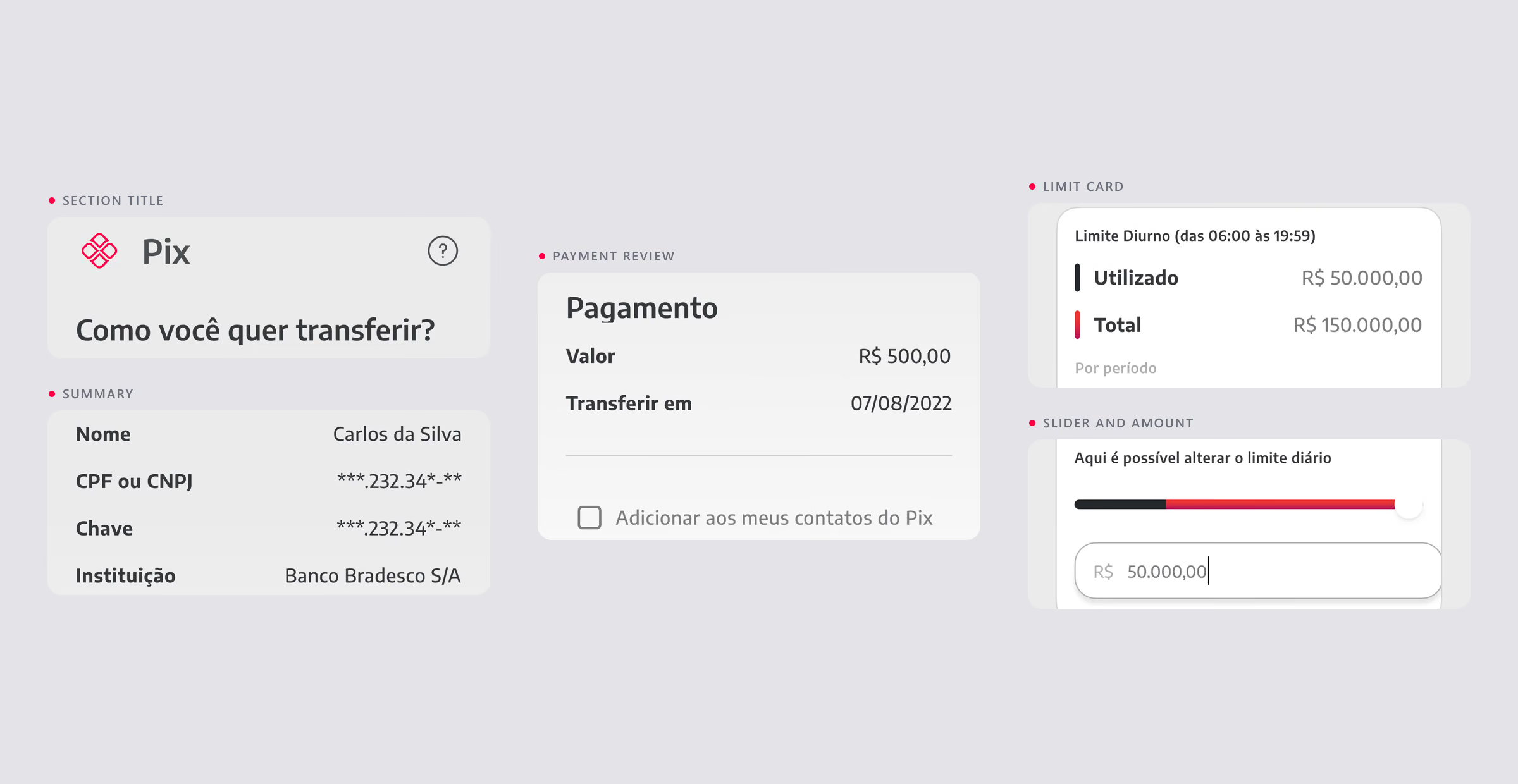
App, internet banking and back office share one design system. A single token source feeds colour, type, spacing and elevation in light and dark, and the components are documented with their states and rules of use.
For the team this meant new flows assembled from existing parts, and for the customer the same language on every screen of the account.
What I learned
Friction makes better interfaces: every bureaucratic click we removed came from listening to where people gave up.
First impressions drive adoption, and design thinking aligned a fast-moving team around four journeys instead of forty features.
Results
Account opening with OCR and biometrics
Flutter codebase for iOS and Android
Critical journeys in the MVP
Frustrated by hidden fees, in research