Background
The fintech market in Brazil is notoriously rigorous: dominated by traditional banks and aggressively contested by digital-native neobanks. Even with so many options, people still navigate convoluted interfaces full of hidden fees and confusing transactional requirements.
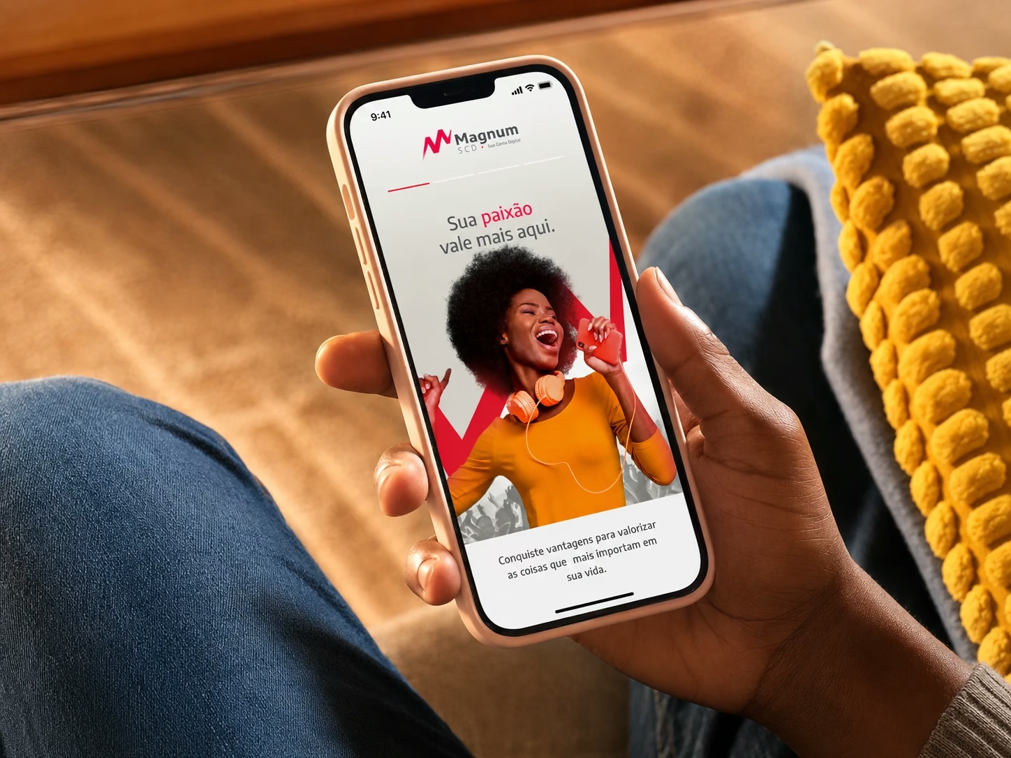
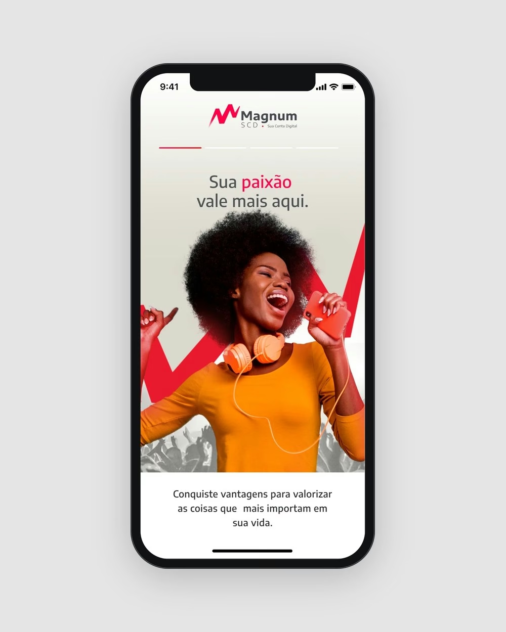
Magnum SCD was conceived at the intersection of transparent financial agility and emotional connection. Its promise, “Here your passion is worth more”, demanded a holistic design approach: we ran design sprints to unpack the industry baseline, define the product foundation, prototype fast and ship.
People felt alienated by their own bank.
Mapping the main frustration factors showed a clear pattern: hidden fees and obscure tariffs (78%), cluttered dashboards (65%), excessive bureaucratic clicks (55%) and unresponsive support (30%). People wanted control and transparency, not more products competing for their attention.
Understanding the problem
Invisible costs
Consumers felt financially alienated, without awareness of how micro-fees were eating into their savings.
Control without judgement
Young adults wanted to take control of complex expenses but didn’t know where to begin without feeling judged.
Banking that can be measured
Small business owners needed the impact of their banking to be transparent and structurally quantifiable.
Here your passion is worth more.
— Magnum SCD brand promise
How we got there
Discover
Market research across Nubank, Banco Inter, C6 Bank and Mercado Pago: value proposition, UX patterns, frictions and support.
Define
Sketching and whiteboard iterations consolidated the MVP into four critical journeys.
Design
Mid-fidelity wireframes first, then a high-fidelity UI with a bold gradient identity and clear hierarchy.
Deliver
Prototypes for engineering and a single Flutter codebase for iOS and Android.
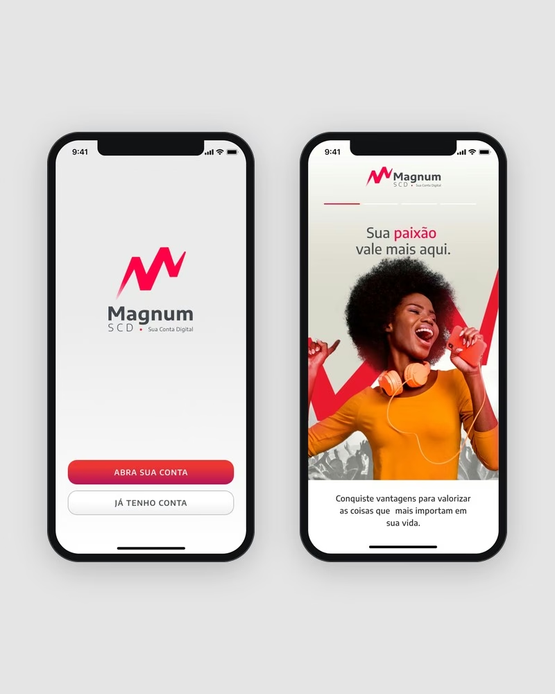
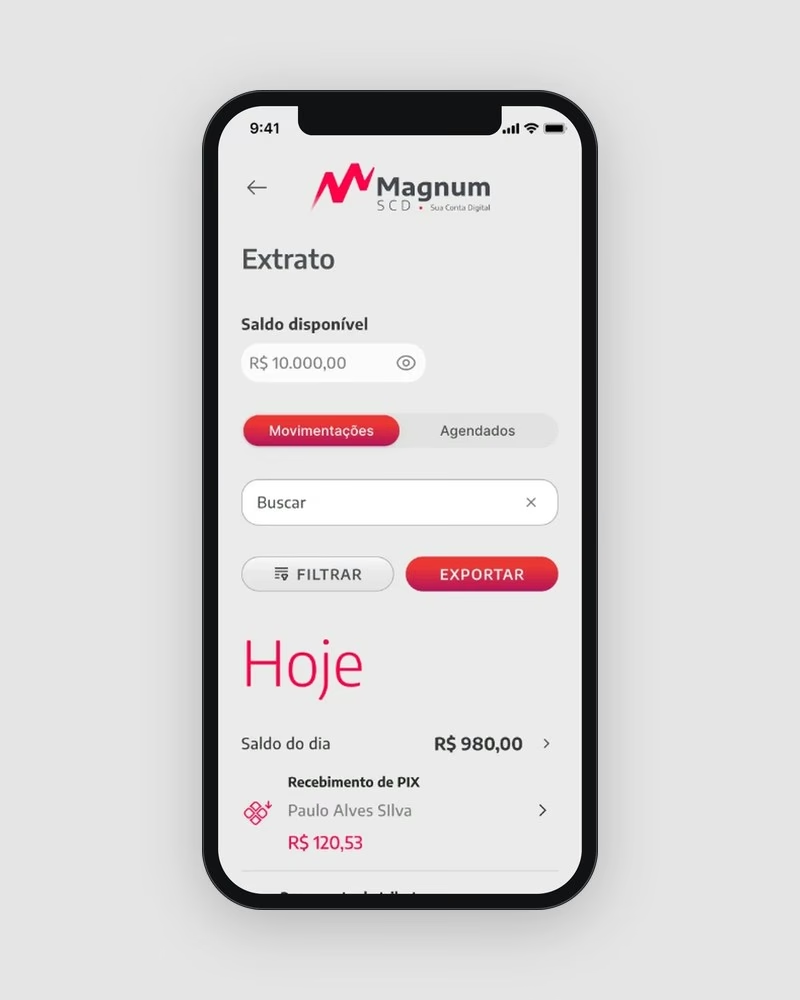
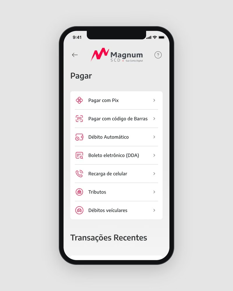
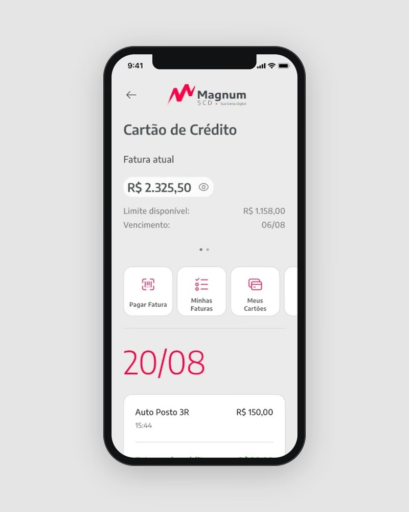
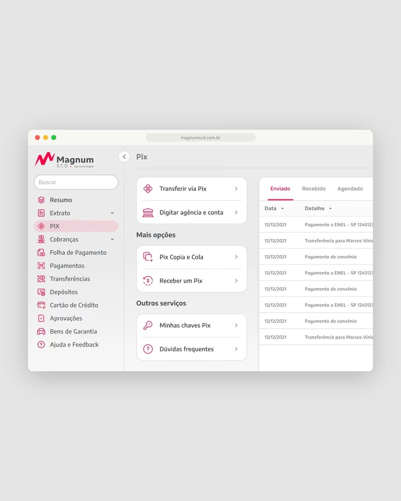
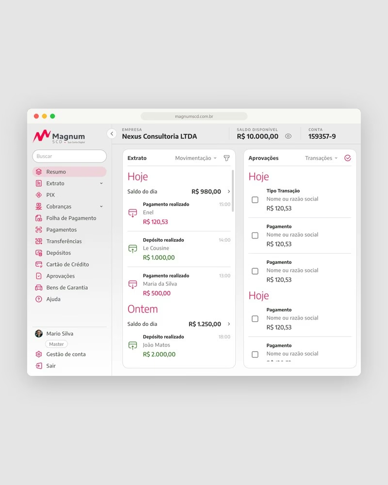
One problem per screen, and the essentials always one tap away.
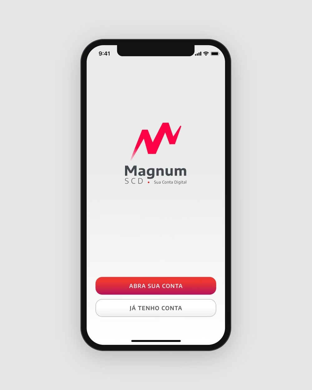
The MVP focused on four journeys: seamless onboarding in under three minutes with OCR and facial biometrics, a smart dashboard that groups expenses automatically, instant transfers on a Pix-first architecture, and benefits connected to the user’s passions.
The goal was to remove cognitive noise: no redundant menus, no excessive gradients, just clear transactional flows, consistent across the app and the internet banking.
Results
Takeaways
Friction makes better interfaces
The best solutions came from the synergy between engineering logic and design empathy, reaching what neither team could alone.
First impressions drive adoption
Banking runs on trust. A smooth onboarding experience was vital to retain early adopters.
Design thinking aligns chaos
Lean frameworks anchored our debates and kept us focused on the core MVP instead of an endless backlog.