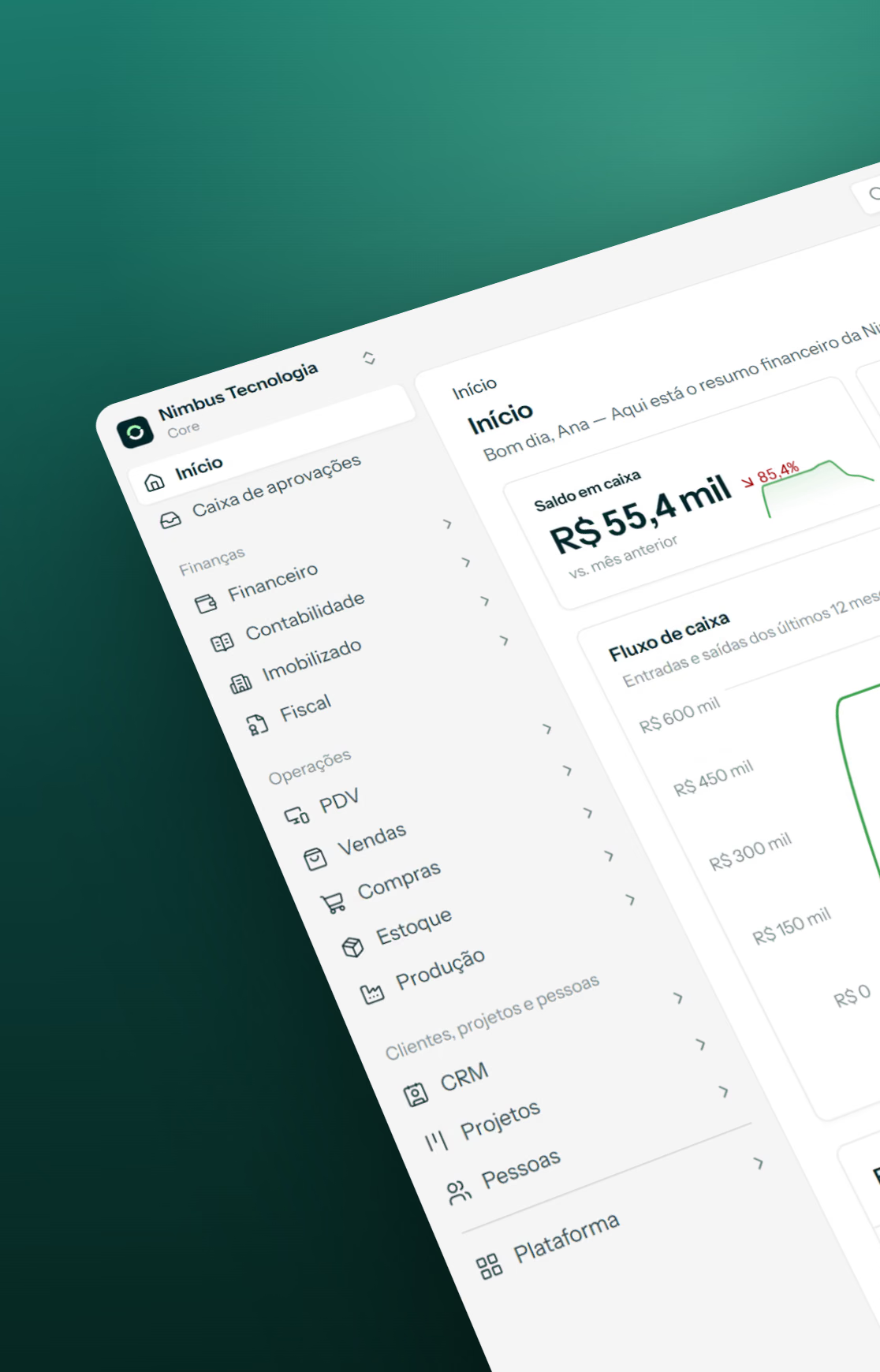
Luna Design System
One token source for Apple and Material, in light and dark
Mobile teams ship the same product twice: once in Apple’s language and once in Google’s, and usually twice more for light and dark. Kits that look complete on day one fall apart on the first rebrand, because colors, radii and type sizes are typed by hand into hundreds of layers.
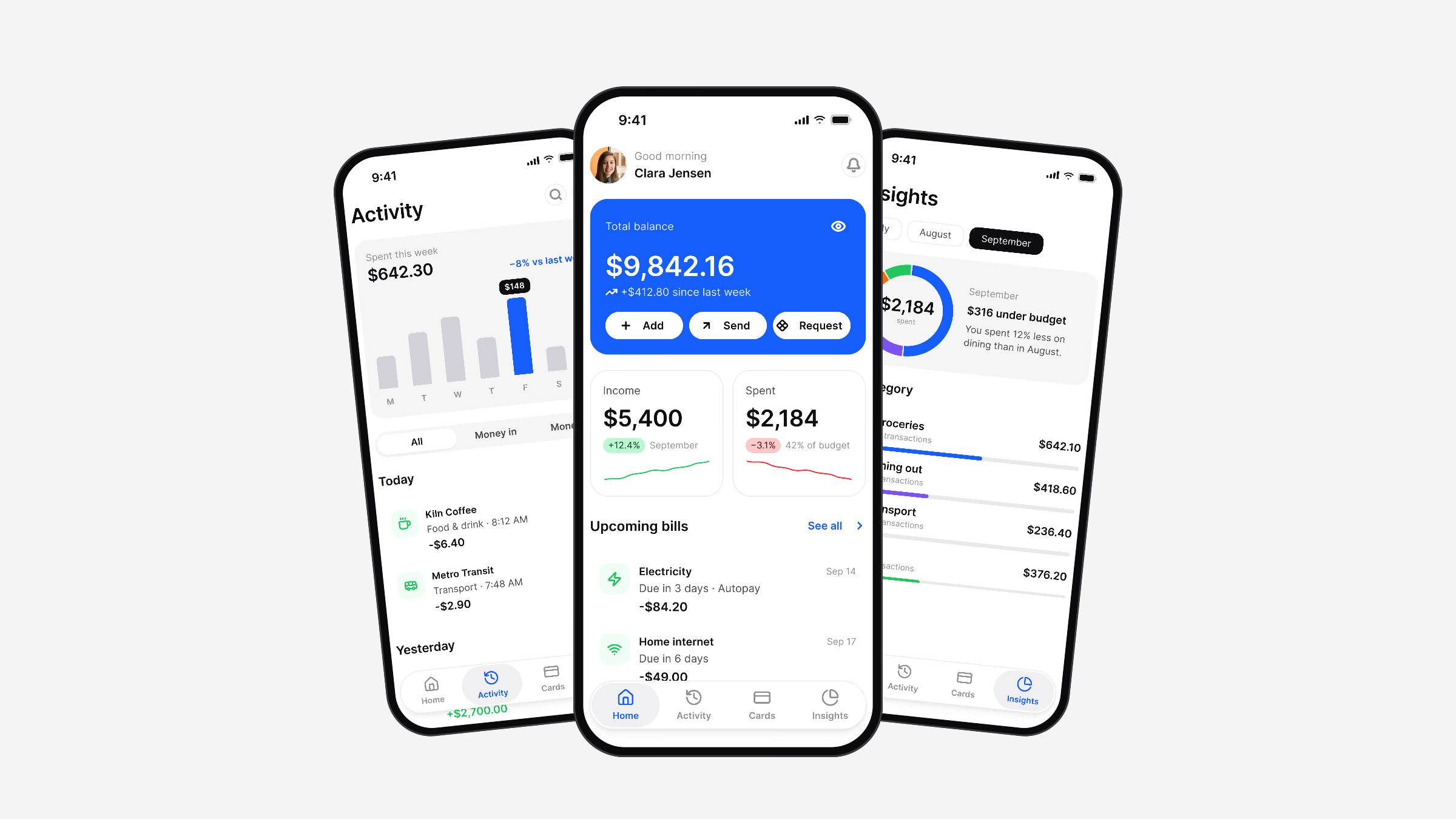
Luna is a Figma design system for iOS and Android apps, built so that one token source drives Apple and Material components in light and dark mode, with outputs for SwiftUI, Jetpack Compose, Flutter and CSS.
- Foundations
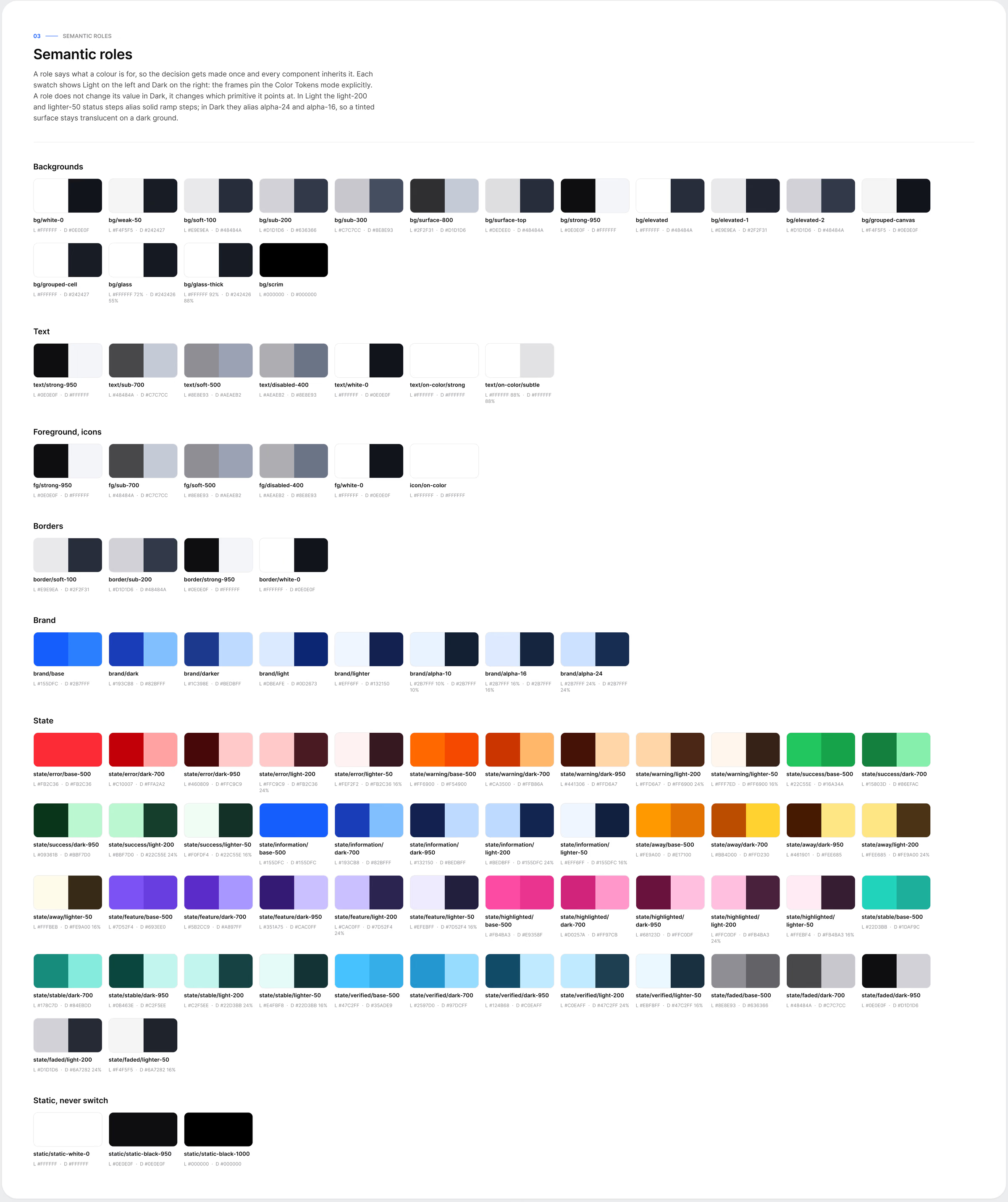
- Semantic tokens
- Components & patterns
- App screens
Process
From problem to delivery, step by step.
05stages documented in this case
- 01Principles
Components point to semantic roles such as brand/base or text/strong-950, never to a value.
- 02Native patterns
21 Apple and 17 Material 3 patterns are redrawn in Luna geometry.
- 03Foundations
Everything starts in the tokens.
- 04In real screens
A system proves itself in use.
- 05What I’d take to the next system
A system is its constraints: no paint styles and no dark variants were deliberate choices, and every shortcut removed was one less place for the…
Principles
Components point to semantic roles such as brand/base or text/strong-950, never to a value. The role points to a foundation, and the chain runs one way only.
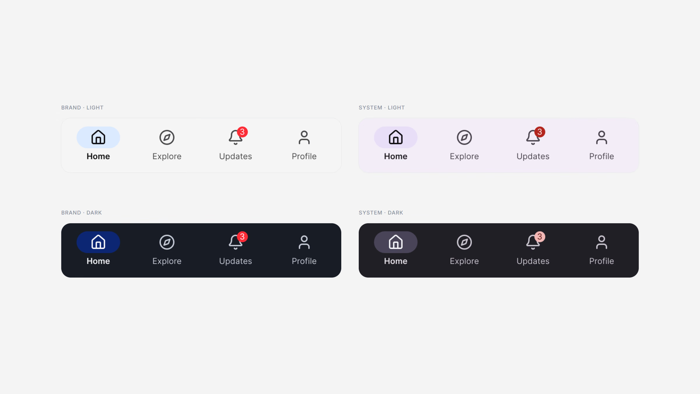
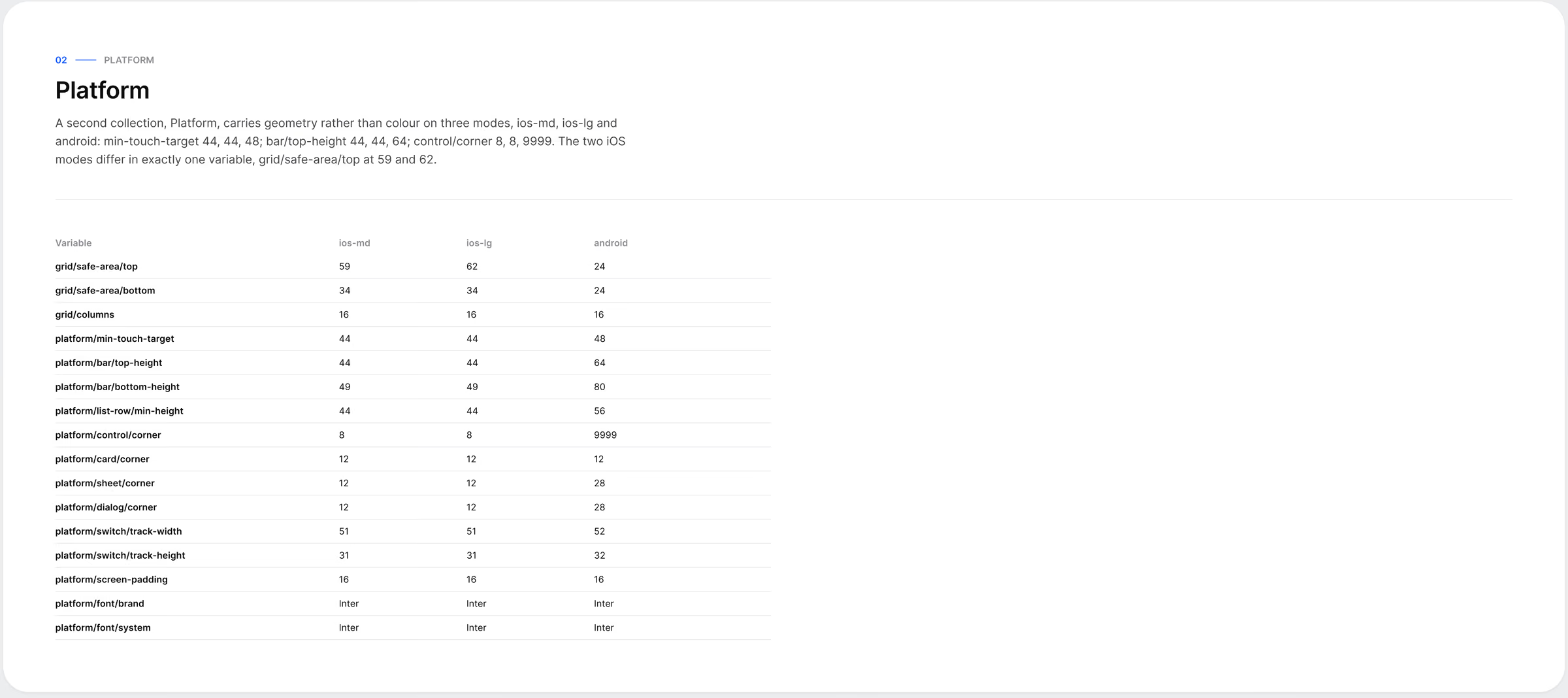
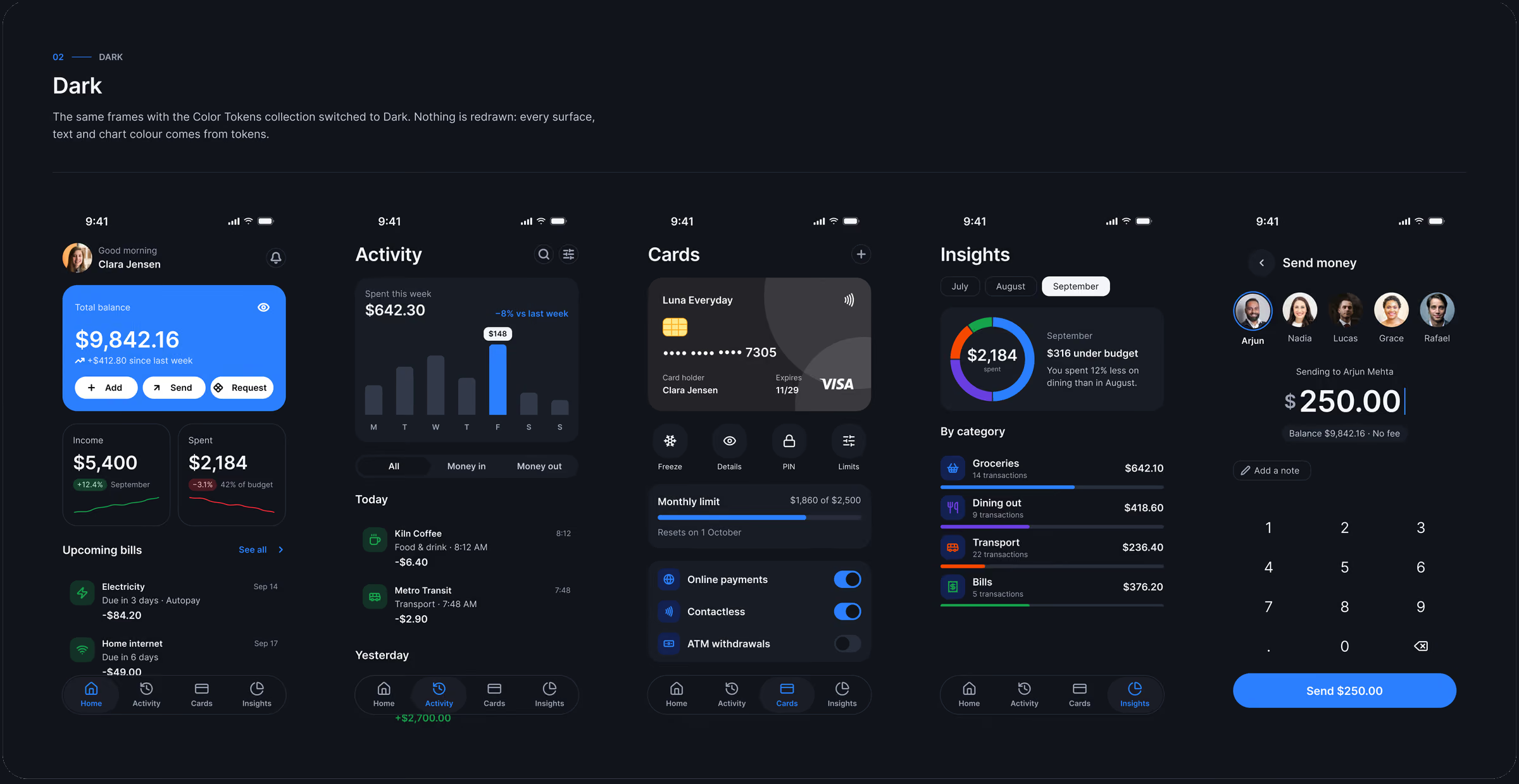
Light and Dark are two modes of one collection, so no component has a dark variant. Platforms differ in numbers, not intent: a Platform collection carries the 44 or 48 point touch targets and bar heights, so one component obeys both.
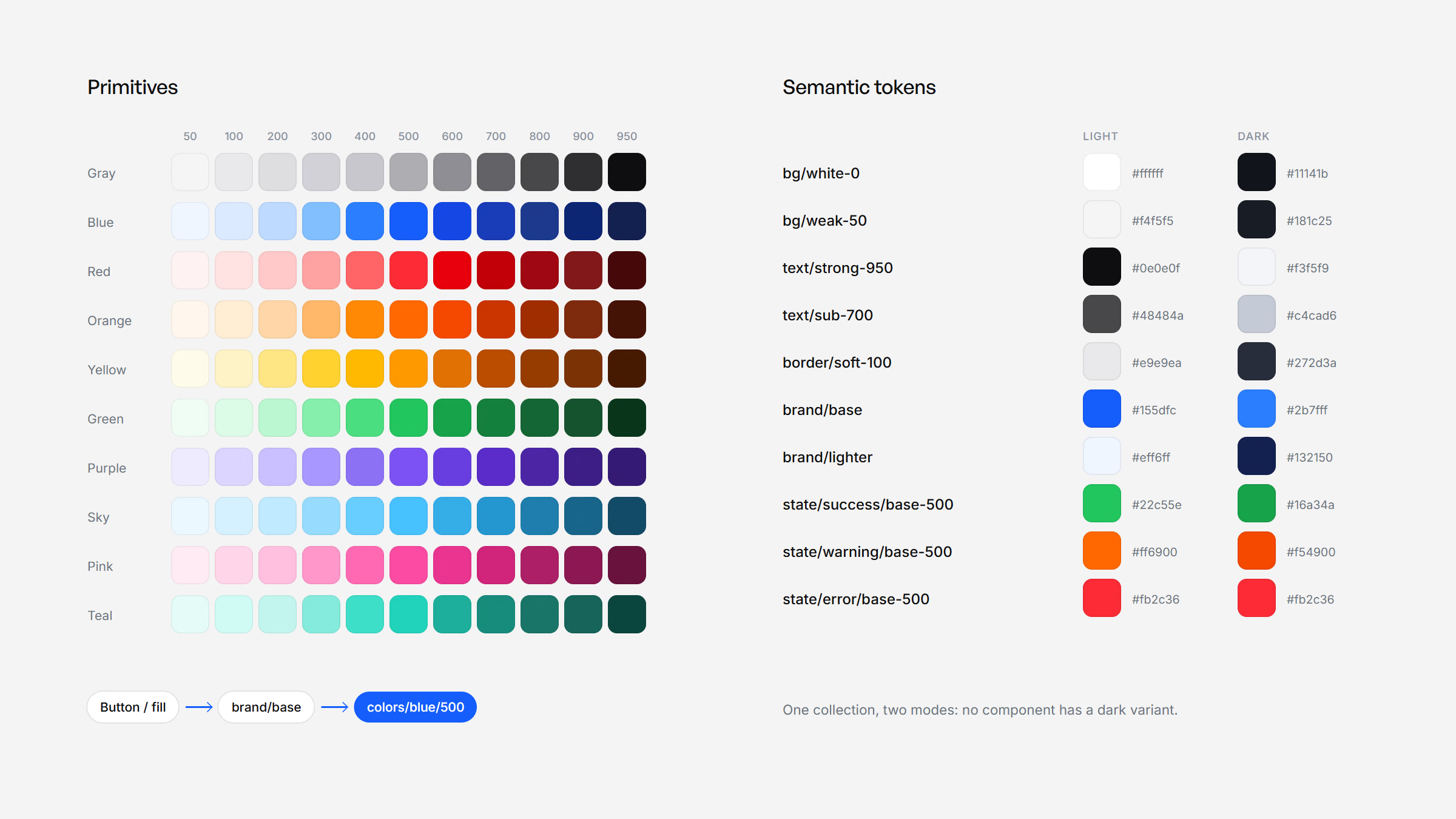
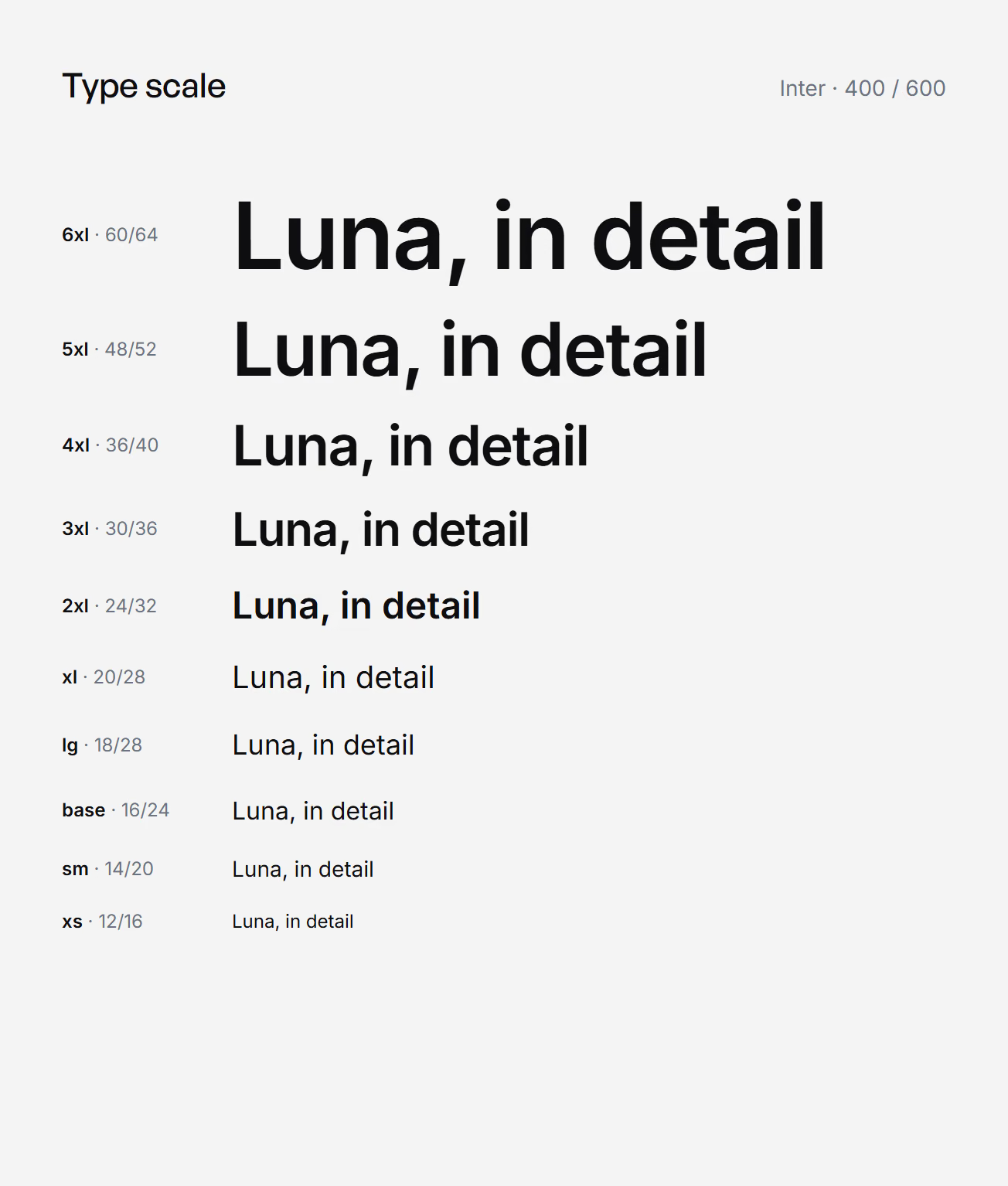
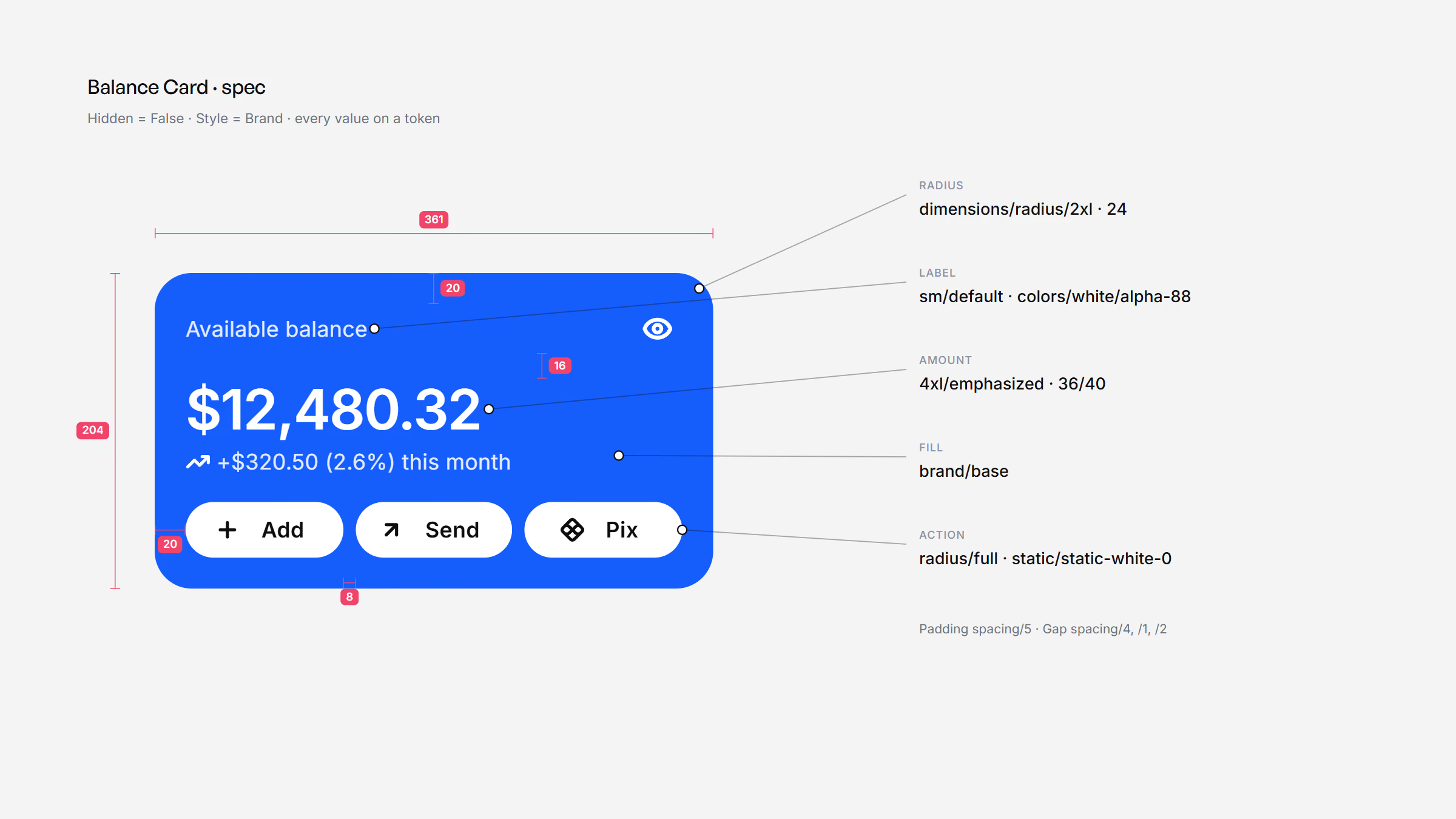
A component never names a color. It names a token, the token names a foundation, and the chain runs one way only.
Luna DS documentation, Read me
Native patterns
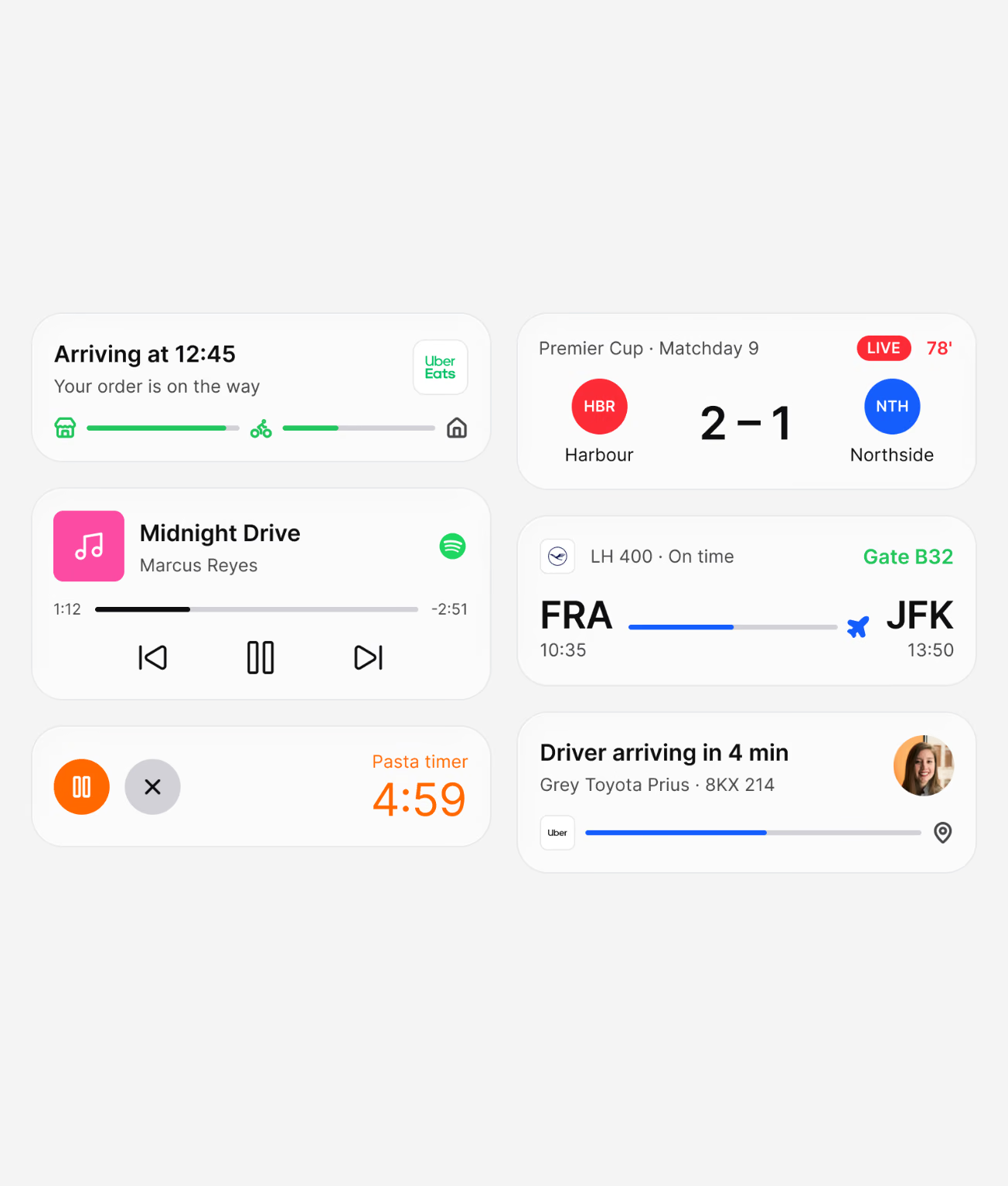
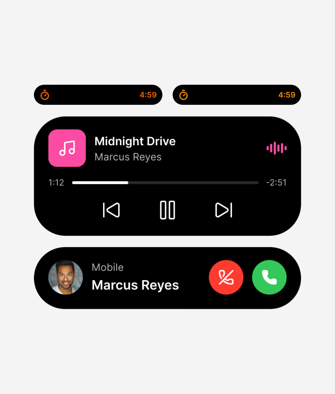
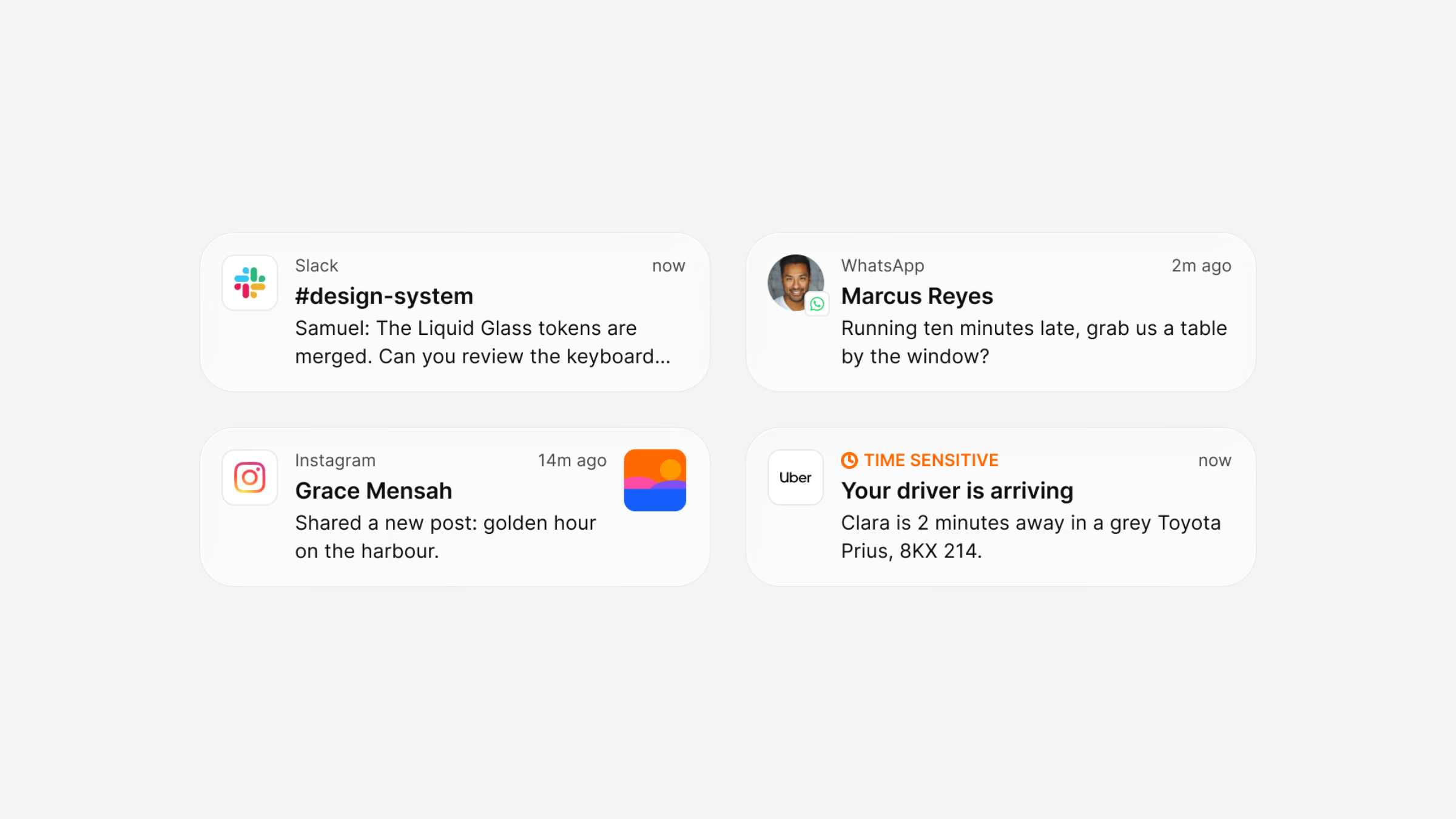
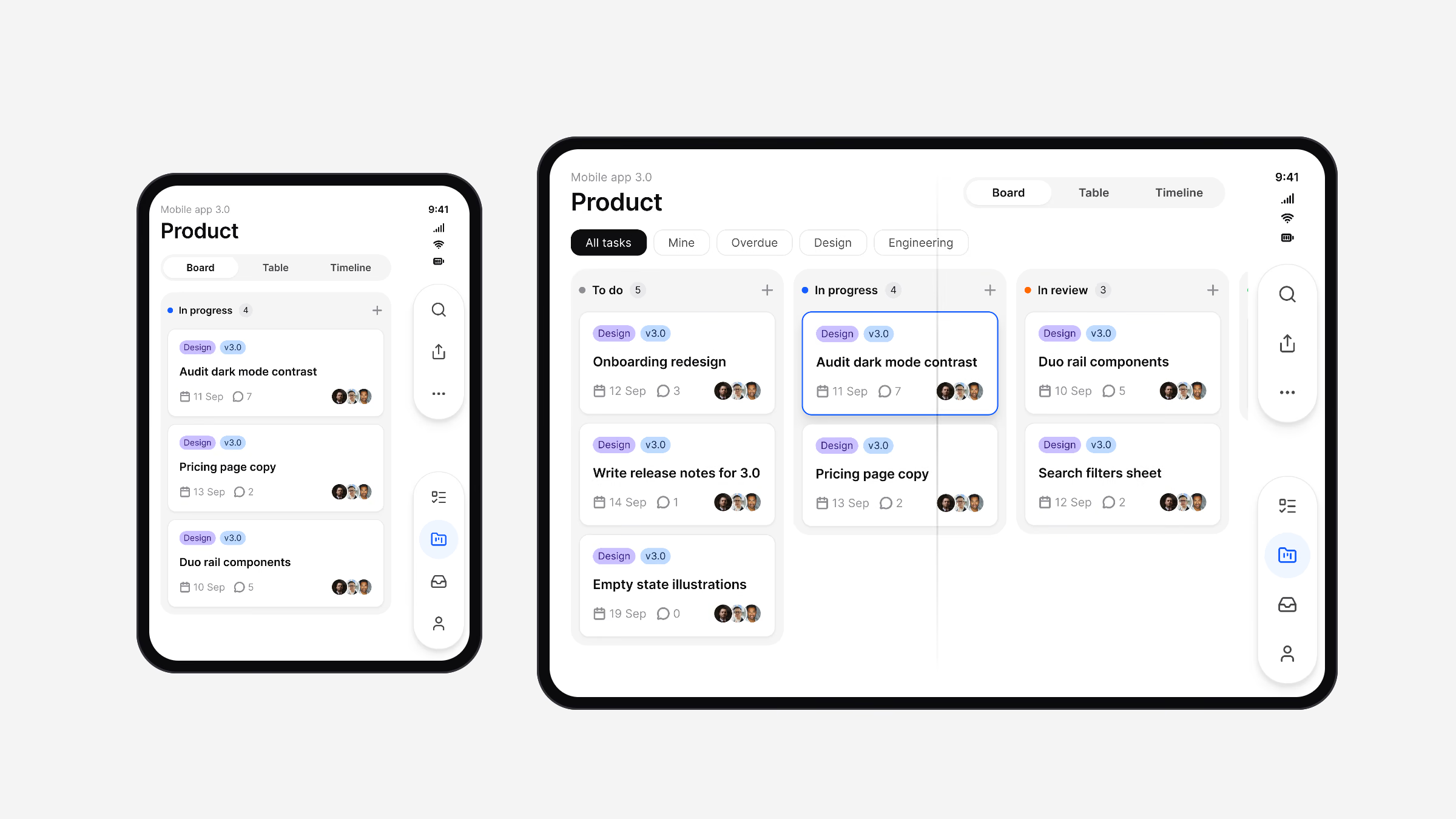
21 Apple and 17 Material 3 patterns are redrawn in Luna geometry. The Platform Bridge maps 112 Apple and Material slots to Luna tokens in Brand mode, or to the platform’s own published values in System mode, so a screen can be checked against the native palette in one switch.
Foundations
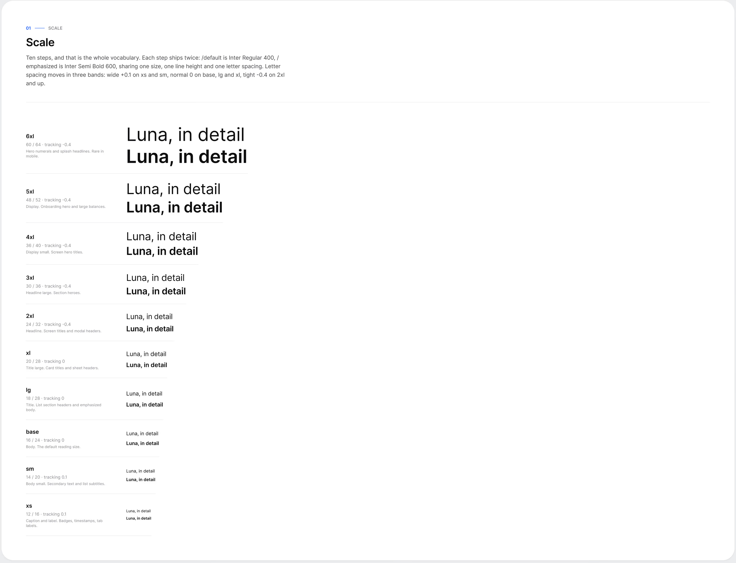
Everything starts in the tokens. Primitive colours become semantic roles with a light and a dark value, and type, spacing and elevation follow the same two-level structure. A component never points to a raw colour, only to a role.
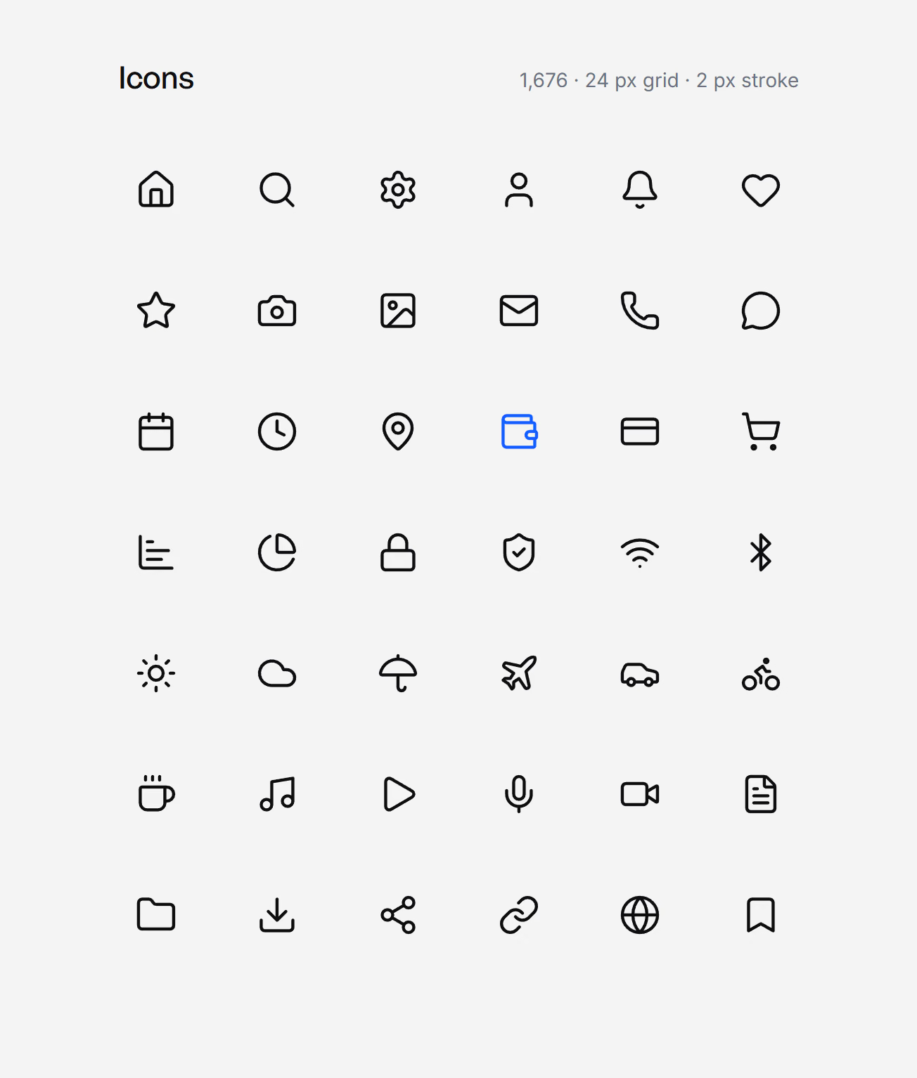
A platform bridge translates the same decisions to iOS and Android sizes, which is what lets one library serve SwiftUI, Compose, Flutter and CSS.
In real screens
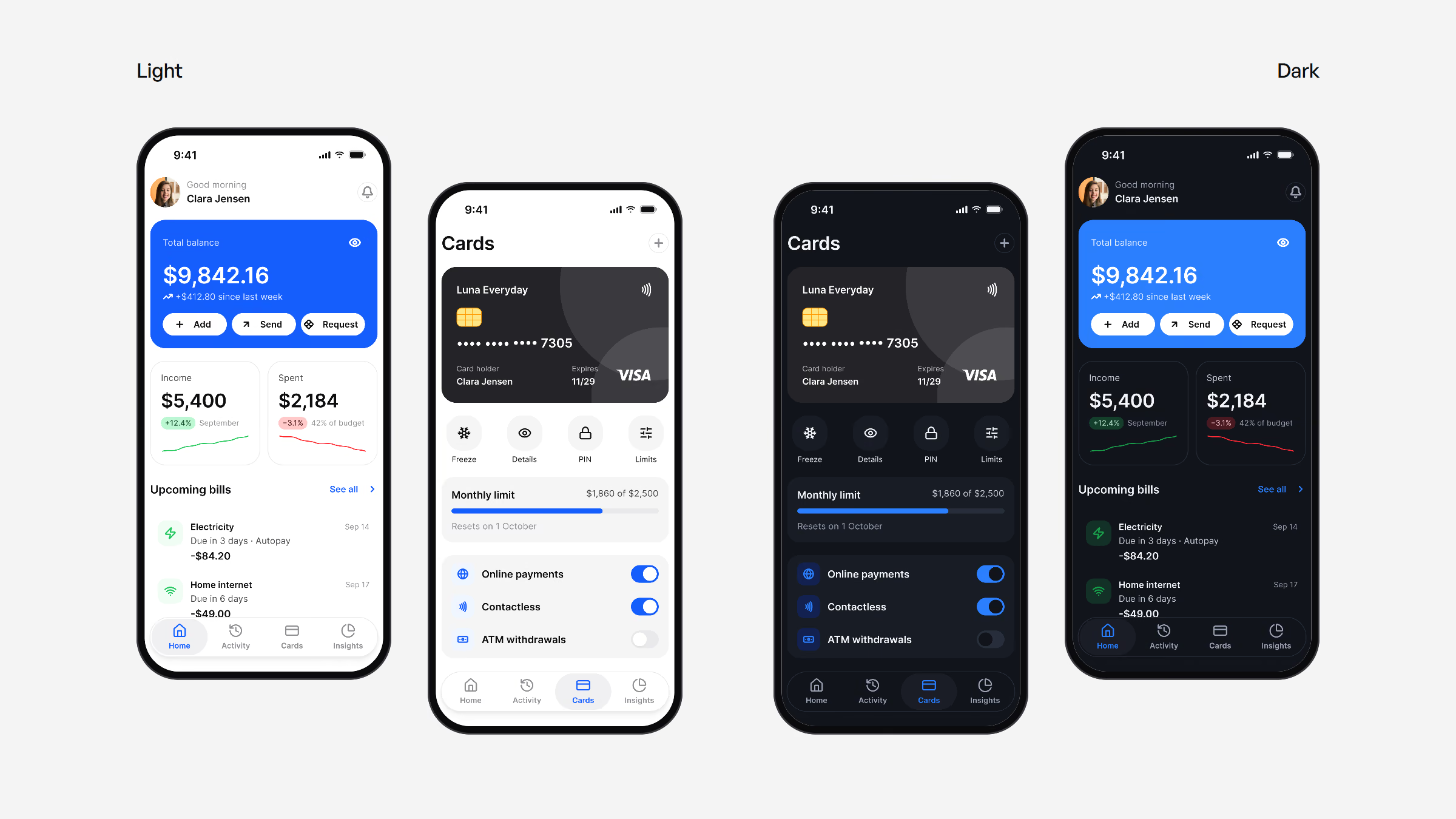
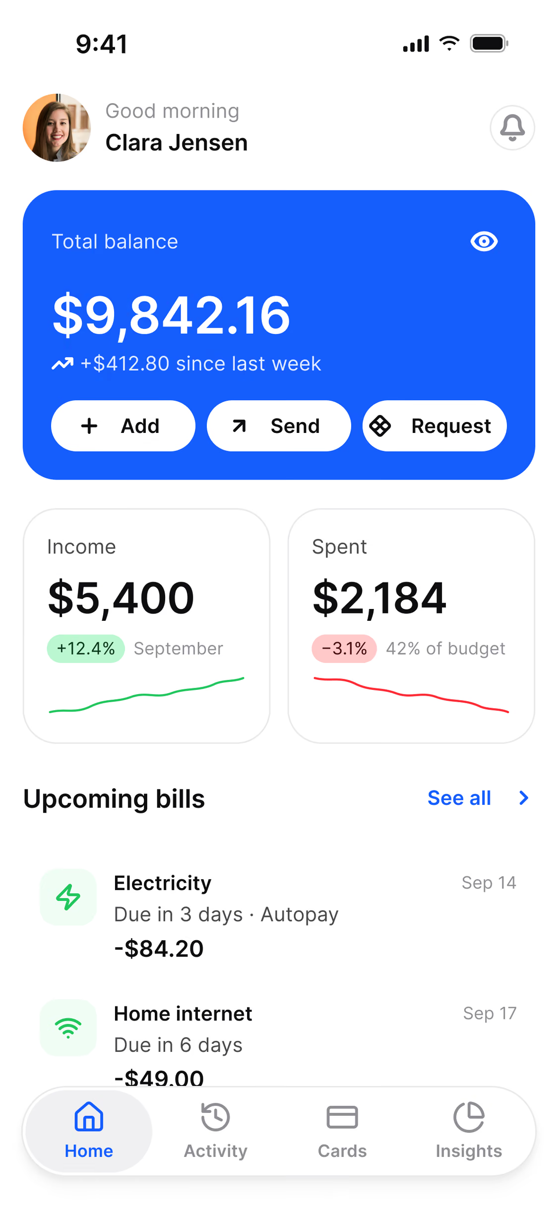
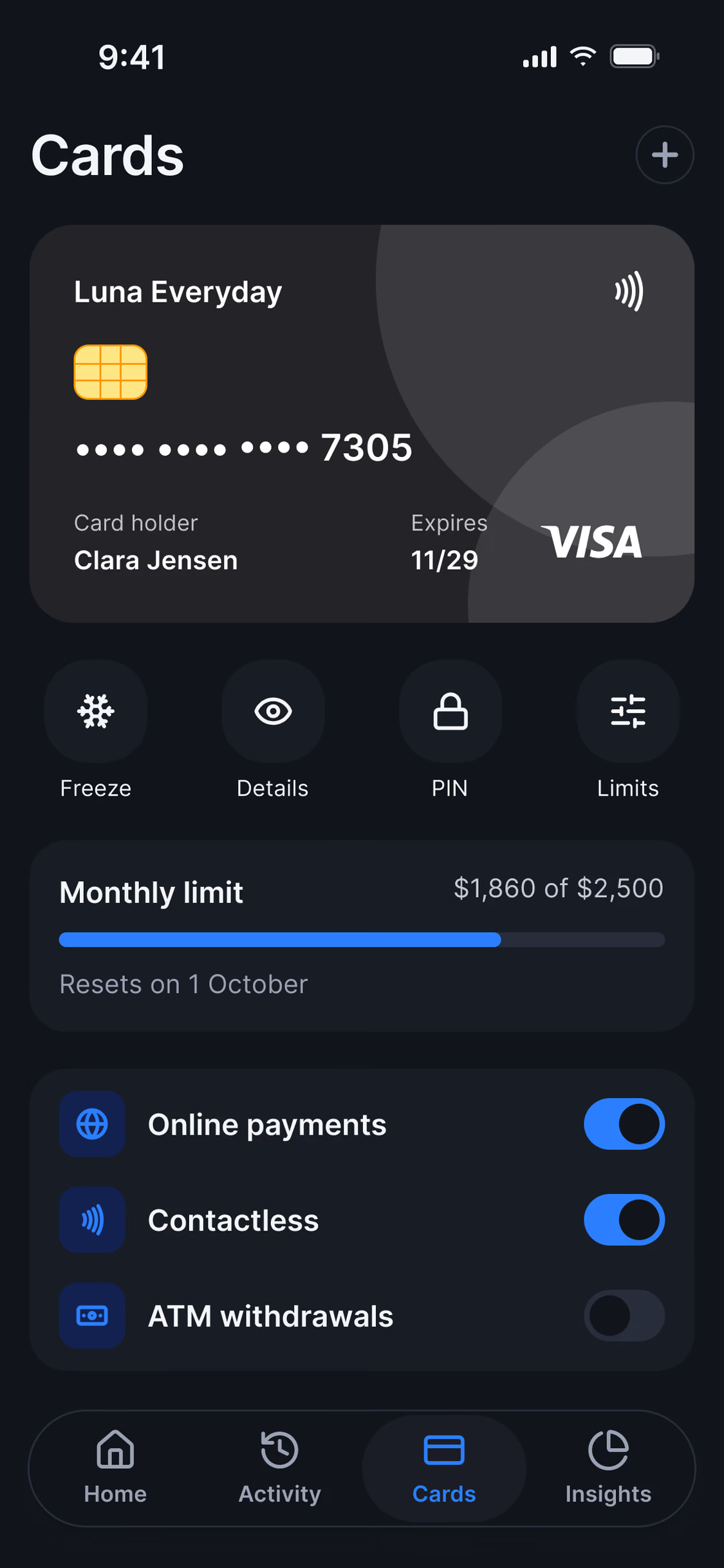
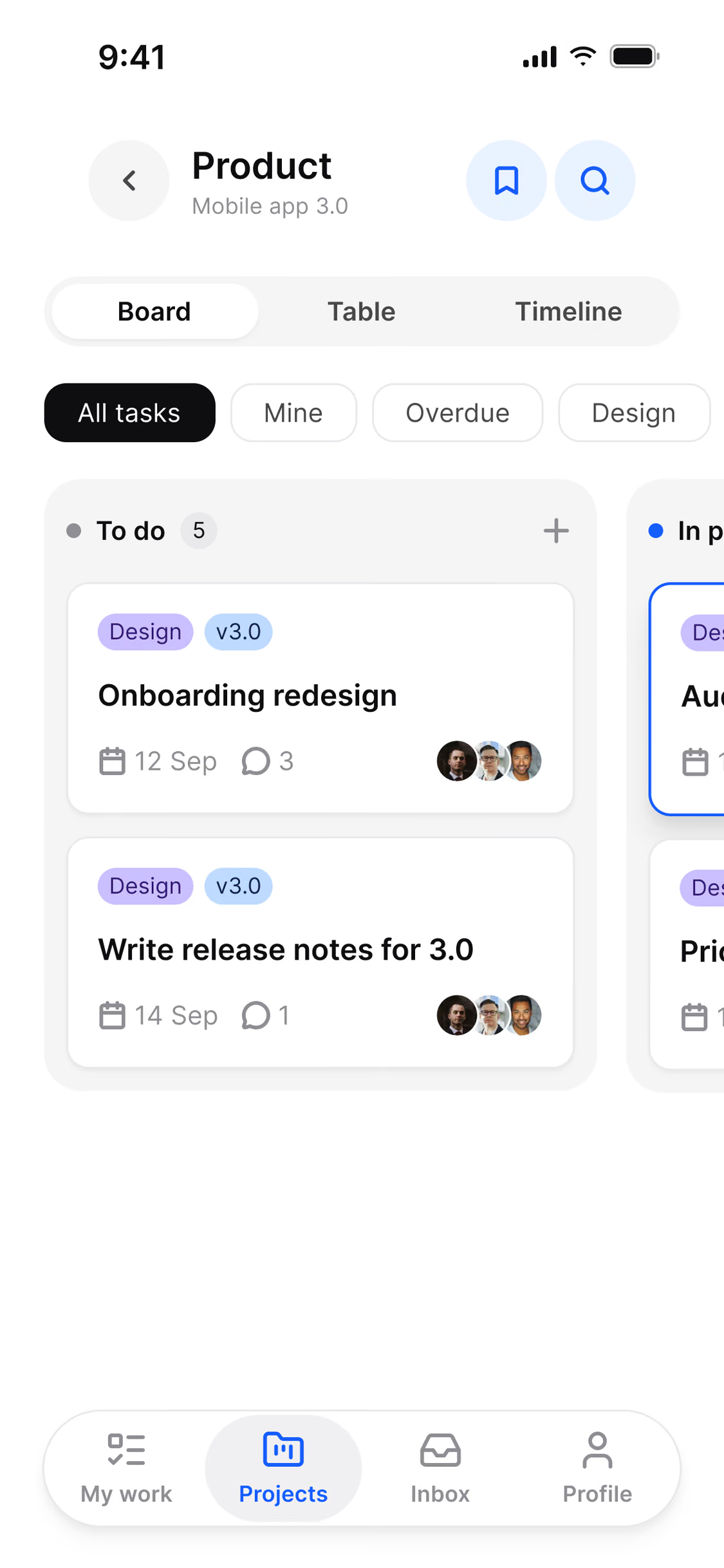
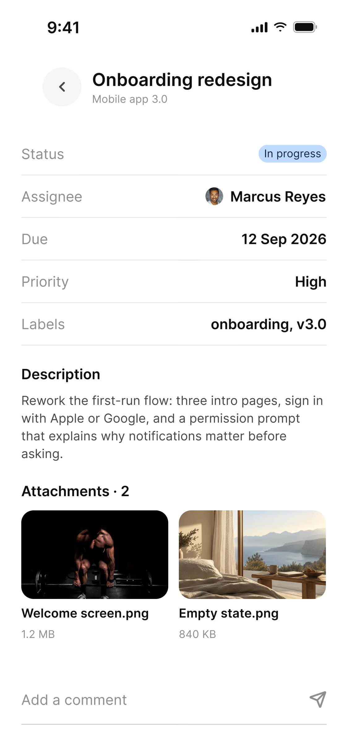
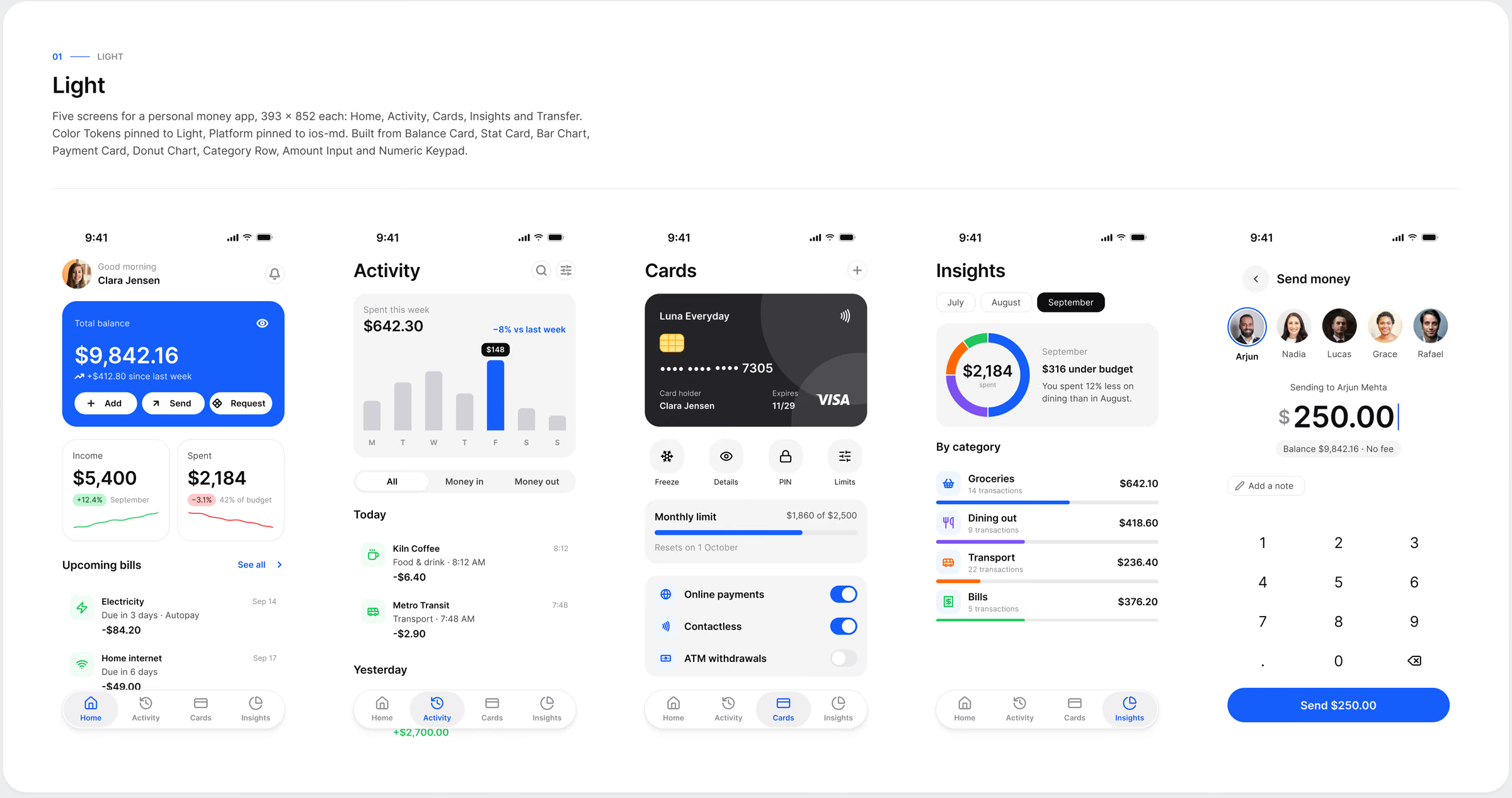
A system proves itself in use. I built complete app screens with the library, in light and dark, to test density, hierarchy and the behaviour of each component with real content before publishing it.
What I’d take to the next system
A system is its constraints: no paint styles and no dark variants were deliberate choices, and every shortcut removed was one less place for the system to drift.
Naming tokens the way SwiftUI, Compose, Flutter and CSS read them kept the file and the code describing the same thing, and complete app screens built only from instances proved the system faster than any documentation page could.
Results
Variables in six collections
Components, every state on a token
App screens in light and dark
Dark variants to maintain